- Graphisoft Community (INT)
- :
- Forum
- :
- Documentation
- :
- Re: FONT SIZING FOR PRINT BLURRED
- Subscribe to RSS Feed
- Mark Topic as New
- Mark Topic as Read
- Pin this post for me
- Bookmark
- Subscribe to Topic
- Mute
- Printer Friendly Page
FONT SIZING FOR PRINT BLURRED
- Mark as New
- Bookmark
- Subscribe
- Mute
- Subscribe to RSS Feed
- Permalink
- Report Inappropriate Content
2023-06-19 03:24 AM - last edited on 2023-06-20 04:22 AM by Karl Ottenstein
Hiii!
Could someone help me out with font/lines thickness and sizing settings?
Is there ANY option to see exactly the fonts sizes on the scale It would print and how it would be readable (no blurred text)?
We will be printing on 18x11" paper:
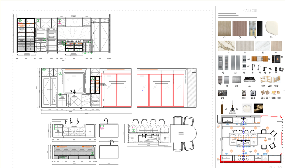
In Layout, the floor plan scale is set up for 1/8" with 5pt size and 0.15pt thickness font. The elevations scale is set up for 1/4" scale with 3pt size font size and 0,15pt thickness.
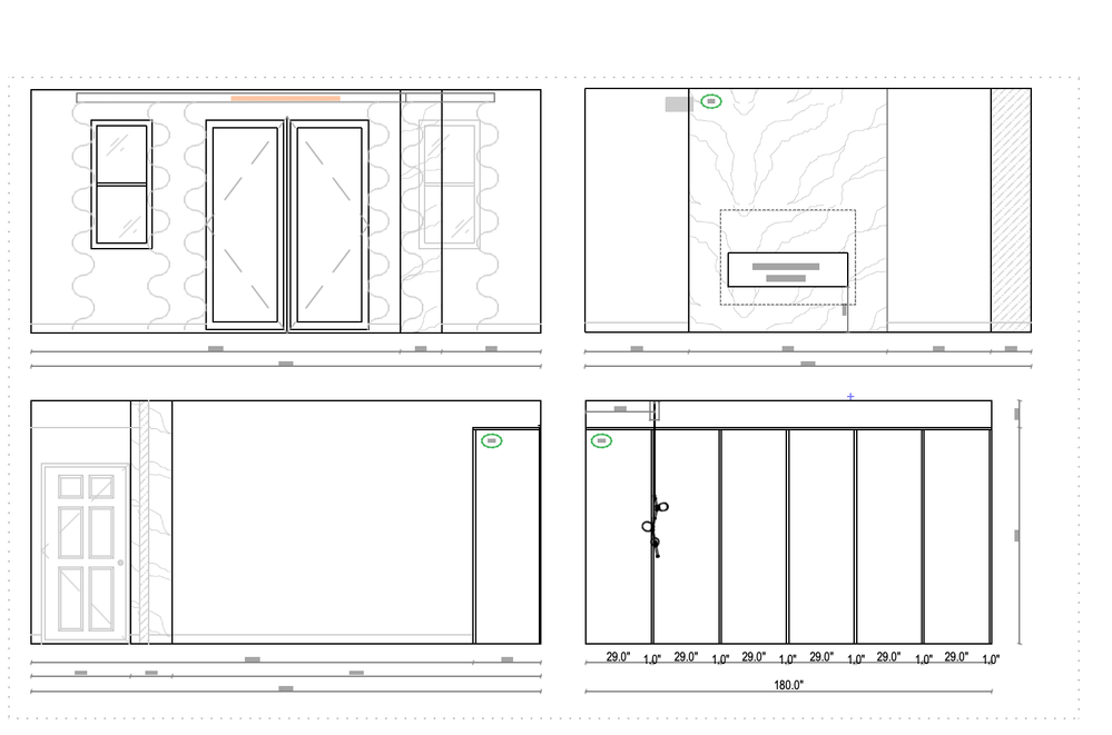
On printscreen attached are also schedules that I put in 7pt which seems to be readable nicely without zooming.... but if I place it on drawings (see printscreen), it looks gigantic?
Am I doing something wrong?
Can I see somewhere exactly how it will look the sizing font printed? (will it be readable?)
If not, .... could someone please suggest what would be Ideal font size and line thinness for 18x17 paper so it's clean, visible and not blurred?
Printscreens attached + printscreen showing larger font text for dimensions that are readable (7pt) .... BUT it looks just huge....
Thank you so much


Archicad Solo 26 and 27 (in testing mode)
- Mark as New
- Bookmark
- Subscribe
- Mute
- Subscribe to RSS Feed
- Permalink
- Report Inappropriate Content
2023-06-19 03:37 AM
I don't work with point sizes, so unsure how they relate to readability.
But I set my text to be 'Scale Independent'.
That way if I use 2mm text, then no matter what scale I set, I know the text will print at 2mm on the page.
I know it is fairly comfortable reading text that is as small as 1.5mm and can go as low as 1.2mm at a stretch.
On screen of course it depends how much you zoom in/out, but you know the text is the size you want to print it at.
You then have views for each view point at the scale you want to place on the layout page.
You do not scale the drawing on the layout.
If you need the same view point (plan, elevation, etc.) at different scales, then you will ideally need different annotation layers for each scale.
That is because the text will appear larger/smaller depending on the scale and will possibly move position depending on your anchor points.
Also at different scales you possibly need different text with more/less information.
Barry.
Versions 6.5 to 27
Dell XPS- i7-6700 @ 3.4Ghz, 16GB ram, GeForce GTX 960 (2GB), Windows 10
Lenovo Thinkpad - i7-1270P 2.20 GHz, 32GB RAM, Nvidia T550, Windows 11
- Mark as New
- Bookmark
- Subscribe
- Mute
- Subscribe to RSS Feed
- Permalink
- Report Inappropriate Content
2023-06-19 03:41 AM
For the larger text, it might help if you increase your witness line size as well so that they are relatively the same. On the other hand 3pt / 1mm text is rather hard to read... we sometimes do not even go down to 2mm...
Unsure if there is a way to turn off text rendering simplification when it gets small...
| AC22-23 AUS 7000 | Help Those Help You - Add a Signature |
| Self-taught, bend it till it breaks | Creating a Thread |
| Win11 | i9 10850K | 64GB | RX6600 | Win10 | R5 2600 | 16GB | GTX1660 |
- Mark as New
- Bookmark
- Subscribe
- Mute
- Subscribe to RSS Feed
- Permalink
- Report Inappropriate Content
2023-06-19 03:53 AM - edited 2023-06-19 03:57 AM
Thank you everyone @Lingwisyer & @Barry Kelly
Alright I guess I am going to update my layouts to the 2mm or 2,5mm for 1/4 scale and 3,5mm to floor plan. (it just looks a bit busy in my view or maybe I get used to it).
Please could you advise line thickness for main drawings and therefore thickness for the fonts to use? (I use now 0.05mm/0.15pt). my concern is I want nice line/fonts, without blur but not too thick. again, this would be for the 1/4" scale on 17"x11"paper/tabloit size)
Archicad Solo 26 and 27 (in testing mode)
- Mark as New
- Bookmark
- Subscribe
- Mute
- Subscribe to RSS Feed
- Permalink
- Report Inappropriate Content
2023-06-19 04:06 AM
Regarding the thickness of your font, are you using some custom line font? Usually the thickness is controlled by the font, did not think there was any way to get around that...
| AC22-23 AUS 7000 | Help Those Help You - Add a Signature |
| Self-taught, bend it till it breaks | Creating a Thread |
| Win11 | i9 10850K | 64GB | RX6600 | Win10 | R5 2600 | 16GB | GTX1660 |
- Mark as New
- Bookmark
- Subscribe
- Mute
- Subscribe to RSS Feed
- Permalink
- Report Inappropriate Content
2023-06-19 04:12 AM
Fonts do not have a thickness like lines.
The pen colour for fonts has no effect.
It is the font you use and whether it is bold, condensed, etc., that will affect how it looks (and the size you choose of course).
Line thicknesses are affected by the pen you use.
How thick you want the line to print is determined by the pen you use.
If you see the same line in different views at different scales, and for some reason you want the pen thickness to be different in each of those views, then you must use another pen set that changes the thickness for that pen.
Barry.
Versions 6.5 to 27
Dell XPS- i7-6700 @ 3.4Ghz, 16GB ram, GeForce GTX 960 (2GB), Windows 10
Lenovo Thinkpad - i7-1270P 2.20 GHz, 32GB RAM, Nvidia T550, Windows 11
- Mark as New
- Bookmark
- Subscribe
- Mute
- Subscribe to RSS Feed
- Permalink
- Report Inappropriate Content
2023-06-19 06:15 AM - edited 2023-06-19 06:16 AM
Hi Barry, this is what I am talking about (yes it’s the pens setting that include set up of color but also a thickness). And my question was related to what thickness is best for 1/4” scale Or What is common to use.
(I do have a custom plan of pens/colors setting, I know how to edit each separately and re-save). My concern is having the perfect line thickness prior wasting money on printing finding out it’s too thin or too thick, just like you had mentioned general size for font, I wanted to see if there is a general size for pen.

Archicad Solo 26 and 27 (in testing mode)
- Mark as New
- Bookmark
- Subscribe
- Mute
- Subscribe to RSS Feed
- Permalink
- Report Inappropriate Content
2023-06-19 07:46 AM
In your image you show a pen that is 0.13mm thick.
As far as I know, no matter what scale view is that you create, and so long as you don't scale the drawing when you place it on a layout, that line should print at 0.13mm thick.
I don't know how accurate it is and I have never tried to measure it.
You would have to create a very thick line, maybe 1.0mm or 2.0mm thick to try an measure it.
I personally use most of the 255 for different purposes, but if I was to simplify my pen set, I basically use pens 1 to 5.
0.1mm, 0.2mm, 0.3mm, 0.4mm & 0.5mm.
General drafting I use pen 1 (0.1mm).
If I need something to appear a little heavier I use pen 2 (0.2mm).
For beam axis lines I use pen 3 (0.4mm).
To really emphasise something I might use pen 4 (0.4mm).
For boxes around notes, I'll use pen 5 (0.5mm).
As I said that is very simplistic.
I have thinner pens and some thicker pens and some the same size but in different colours,so I can tell what they are used for by colour.
I find this fine for my main plans at 1:100 and 1:50 scale.
For large scale details, I find I am not using the elements from the model, so I am not so concerned about the pen thicknesses used for them.
I find I am drawing them as 2D line work and so use the same 5 pens.
Basically, as I did back in manual drafting days when I had 5 or so ink pen thicknesses to choose from.
Barry.
Versions 6.5 to 27
Dell XPS- i7-6700 @ 3.4Ghz, 16GB ram, GeForce GTX 960 (2GB), Windows 10
Lenovo Thinkpad - i7-1270P 2.20 GHz, 32GB RAM, Nvidia T550, Windows 11
- Mark as New
- Bookmark
- Subscribe
- Mute
- Subscribe to RSS Feed
- Permalink
- Report Inappropriate Content
2023-06-19 01:26 PM
Typical pen weight chart still follows those ink pens, so 0.13 mm, 0.18 mm, 0.25 mm, 0.35 mm, 0.50 mm, 0.70 mm and so on. There are thicker pens, but I never use them. We also have extra thin (0.09 mm) and hairline (0 mm) pens.
Typically we use the following:
0.13 = dotted outlines / vectorial cut fill pen
0.18 = projected outlines or insulation cut lines
0.25 = thinnest cut line for non-structural thin elements (typically finishes)
0.35 = cut line for bricks and similar finishes
0.50 = cut line for concrete / steel
0.70 = thickest cut line (terrain typically)
I can recommend having a set of similar pen weights in black, grey, red, green and blue. Grey pens are great for furniture, finish trim, vectorial pattern fills and other elements that shouldn't 'pop' too much and then allow for black text to be easily read if it overlaps. Red, green and blue are great for annotation that needs to pop.
This isn't so much ArchiCAD specific as it is part of drawing standards, stuff taught in school etc
www.leloup.nl
ArchiCAD 9-26NED FULL
Windows 10 Pro
Adobe Design Premium CS5
- Mark as New
- Bookmark
- Subscribe
- Mute
- Subscribe to RSS Feed
- Permalink
- Report Inappropriate Content
2023-06-19 08:46 PM
Ok this is perfect thank you very much! I just noticed that my archicad fonts are actually set up to inches (instead of pt or mm), while my dimensions and line sizes are in pt only. By any chance would you know if I can set up both samely, or some convertor? I would like to use 9pt for floor plans but I used some converts and it shows as 0,11" which is miniature... and does not look like 9pt dimensions that I set up correctly :((((( I don't know why archicad make this super Difficult I just spent whole day setting everything up only find out its not even same :D.


Archicad Solo 26 and 27 (in testing mode)

