- English
- :
- Forum
- :
- Our Community
- :
- Feedback on the restructure
- Subscribe to RSS Feed
- Mark Topic as New
- Mark Topic as Read
- Pin this post for me
- Bookmark
- Subscribe to Topic
- Mute
- Printer Friendly Page
- Mark as New
- Bookmark
- Subscribe
- Mute
- Subscribe to RSS Feed
- Permalink
- Report Inappropriate Content
2023-05-10 09:50 AM
Feedback on the restructure
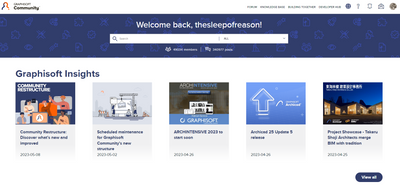
Although the new sub forums improves the overall structure its not enough for a good forum experience. I think the majority of active users primarily are interested in the forum part of the community and it should thus be put front and center. My landing page still looks like below which makes it evident that a lot of earlier feedback regarding user experience must have been disregarded - or is it the platform interface setting a hard limit?
Some points:
- The new forum overview is hidden away under the dropdown item. It should replace or integrate with the hot topics at the landing page.
- It is not possible to quickly navigate between different sub forums. It should not be done through a dropdown and a new page.
- There is no information about the topic of the latest posts in the overview.
- It is not possible to get a list of all new posts (I will still have to use the unread bookmark to effectively keep track of the activity).
- From the overview it is not possible to mark new posts as read.
- User activity (posts/replies) are hidden away under user profile.
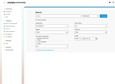
- Search and filter is still quite detached from the forum, limited and cumbersome to use.
It is frustrating to see GS struggle this hard just to get a well functioning, effective and user-friendly forum in place - especially as there are many out of the box solutions available. I understand the approach with the integrating everything under one platform but is it worth it if Khoros can't be set up better than this?
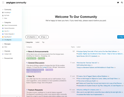
For reference. Below is an example of what an user-friendly (and quite common) forum interface looks like.
- Mark as New
- Bookmark
- Subscribe
- Mute
- Subscribe to RSS Feed
- Permalink
- Report Inappropriate Content
2023-09-04 12:48 PM
I do hate the thread arrangement and I can't seem to find an option that doesn't have issues whichever way it is organised. I am fairly sure important posts are being missed because they become buried in the notifications by other posts from the same person in the same thread. The old post order method worked, and it was easy enough to quote a post if you needed to back reference an earlier conversation.
- « Previous
-
- 1
- 2
- Next »
- « Previous
-
- 1
- 2
- Next »
Didn't find the answer?
Check other topics in this Forum
Back to ForumRead the latest accepted solutions!
Accepted SolutionsStart a new conversation!
- Simple and FREE quantity take-off AddOn (BIMquantsLite) in Project data & BIM
- Floor plan generator in Parametric design
- Architect Vacancy - Dubai Based - ELE Interior Design - Archicad essential. in General discussions
- Archicad, I havent seen you in so long in General discussions
- Display construction grid with 1x1 mm in Modeling


