- English
- :
- Forum
- :
- Visualization
- :
- Crytics please
- Subscribe to RSS Feed
- Mark Topic as New
- Mark Topic as Read
- Pin this post for me
- Bookmark
- Subscribe to Topic
- Mute
- Printer Friendly Page
- Mark as New
- Bookmark
- Subscribe
- Mute
- Subscribe to RSS Feed
- Permalink
- Report Inappropriate Content
2007-09-07
01:37 PM
- last edited on
2023-05-11
01:42 PM
by
Noemi Balogh
Crytics please

- Mark as New
- Bookmark
- Subscribe
- Mute
- Subscribe to RSS Feed
- Permalink
- Report Inappropriate Content
2007-09-07 01:56 PM
Myself I would have less mirroreffect on the glas.
- Mark as New
- Bookmark
- Subscribe
- Mute
- Subscribe to RSS Feed
- Permalink
- Report Inappropriate Content
2007-09-07 01:58 PM
- Mark as New
- Bookmark
- Subscribe
- Mute
- Subscribe to RSS Feed
- Permalink
- Report Inappropriate Content
2007-09-12 06:12 PM
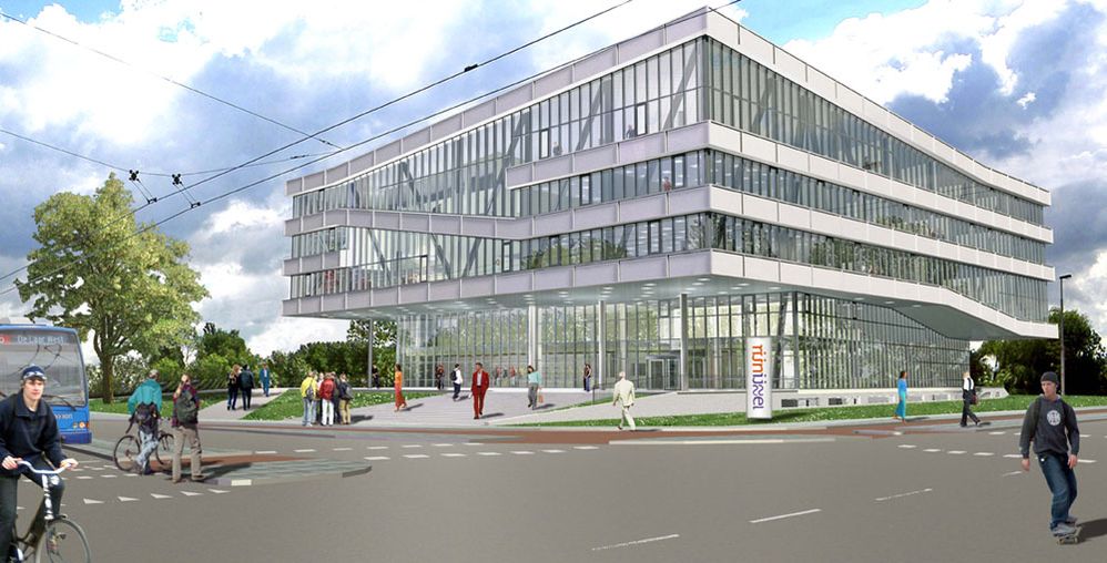
This is a nice rendering because the building is "light," having no sinister shadows that usually plague LightWorks [as implemented in Archicad] images. Combining this with a cloudy sky background makes the image plausible since clouds could reflect sunlight into the overhanging areas that are usually so dark. You have managed LightWorks well - especially the whites!!
I take issue with two other matters - but about taste, not technology:
1: Entourage placement.
The foreground teenagers distract me from the subject. The one on the left is going to steal my purse the way he is looking, even if he is driving an innocuous 200kg Dutch bicycle. Good thing it is flat, there. The one on the right is his accomplice. Perhaps he is the one with the knife. I would never notice the tall Dutchman except for his gaudy RED SUIT. The three orange/red figures are also a distraction.
3: Composition.
1/4 of your art is pavement. Pavement should always be a tiny part of any image - like a plinth, say. If it must be huge, dapple shadows on it and fill it with cars, not skateboarder thief punks.
I feel the top corner of the building is crammed - add more sky.
My inclination is to move the camera to the left to disambiguate the diagonal facade line.
- Mark as New
- Bookmark
- Subscribe
- Mute
- Subscribe to RSS Feed
- Permalink
- Report Inappropriate Content
2007-09-13 07:47 AM
Dwight wrote:
I was asked by private message to comment, so here goes:I would never notice the tall Dutchman except for his gaudy RED SUIT.
- Mark as New
- Bookmark
- Subscribe
- Mute
- Subscribe to RSS Feed
- Permalink
- Report Inappropriate Content
2007-09-13 03:37 PM
First of all I wanted to know who you feel about the rendering (I felt good about it) and apparently it is quite good. But i wanted to hear it from the Yoda of Lghtworks
Thanks again, now i can sleep again............
- Mark as New
- Bookmark
- Subscribe
- Mute
- Subscribe to RSS Feed
- Permalink
- Report Inappropriate Content
2007-09-13 08:44 PM
- Mark as New
- Bookmark
- Subscribe
- Mute
- Subscribe to RSS Feed
- Permalink
- Report Inappropriate Content
2007-09-13 08:56 PM
- Mark as New
- Bookmark
- Subscribe
- Mute
- Subscribe to RSS Feed
- Permalink
- Report Inappropriate Content
2007-09-14 11:00 AM
So I've another question for you guys. For making this rendering I received a wide angle picture of the site. Therefore the building is created in a wideangle shot as well. But after reading you're remarks, i think it is better to create an image that's more like a view from the human eye?
And next to that, although there are cables in the view in reality, skip them when it's distracting? ( I would think it would add more realism in the picture.)
- Mark as New
- Bookmark
- Subscribe
- Mute
- Subscribe to RSS Feed
- Permalink
- Report Inappropriate Content
2007-09-14 04:16 PM
