Turn on suggestions
Auto-suggest helps you quickly narrow down your search results by suggesting possible matches as you type.
Showing results for
EN
Turn on suggestions
Auto-suggest helps you quickly narrow down your search results by suggesting possible matches as you type.
Showing results for
- English
- :
- Forum
- :
- Visualization
- :
- Re: critique artlantis rendering
Options
- Subscribe to RSS Feed
- Mark Topic as New
- Mark Topic as Read
- Pin this post for me
- Bookmark
- Subscribe to Topic
- Mute
- Printer Friendly Page
Anonymous
Not applicable
Options
- Mark as New
- Bookmark
- Subscribe
- Mute
- Subscribe to RSS Feed
- Permalink
- Report Inappropriate Content
2009-04-24
07:08 AM
- last edited on
2023-05-11
12:16 PM
by
Noemi Balogh
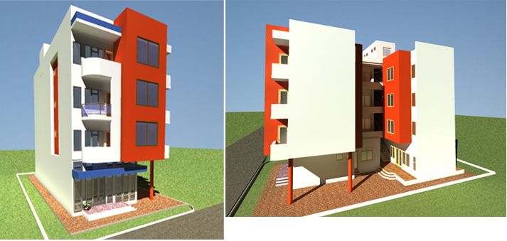
critique artlantis rendering
2009-04-24
07:08 AM
Thanks.
Using AC 12, Artlantis 1.2

2 Replies 2
Anonymous
Not applicable
Options
- Mark as New
- Bookmark
- Subscribe
- Mute
- Subscribe to RSS Feed
- Permalink
- Report Inappropriate Content
2009-04-24 10:17 AM
2009-04-24
10:17 AM
Some points that need improvement:
You use too much light compared to your background image. Lower the intensity if the sunlight to match it with the background image.
The direction of the sun differs from your background image.
Lower your camera to human height; eyelevel, to make it more realistic.
You use a wideangle lens. Your building changes into a doll house compared to your background image, so change the lens angle to let it match.
I hope this helps you
Sjaak
Anonymous
Not applicable
Options
- Mark as New
- Bookmark
- Subscribe
- Mute
- Subscribe to RSS Feed
- Permalink
- Report Inappropriate Content
2009-05-03 06:44 PM
2009-05-03
06:44 PM
made a little improvement on light and viewpoint here to make a final output.


Didn't find the answer?
Check other topics in this Forum
Back to ForumRead the latest accepted solutions!
Accepted SolutionsStart a new conversation!
Suggested topics
