- Graphisoft Community (INT)
- :
- Forum
- :
- Documentation
- :
- Fonts displaying incorrectly after moving up to AC...
- Subscribe to RSS Feed
- Mark Topic as New
- Mark Topic as Read
- Pin this post for me
- Bookmark
- Subscribe to Topic
- Mute
- Printer Friendly Page
Fonts displaying incorrectly after moving up to AC26.
- Mark as New
- Bookmark
- Subscribe
- Mute
- Subscribe to RSS Feed
- Permalink
- Report Inappropriate Content
2022-08-19 05:52 AM - edited 2022-08-19 06:00 AM
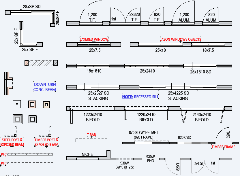
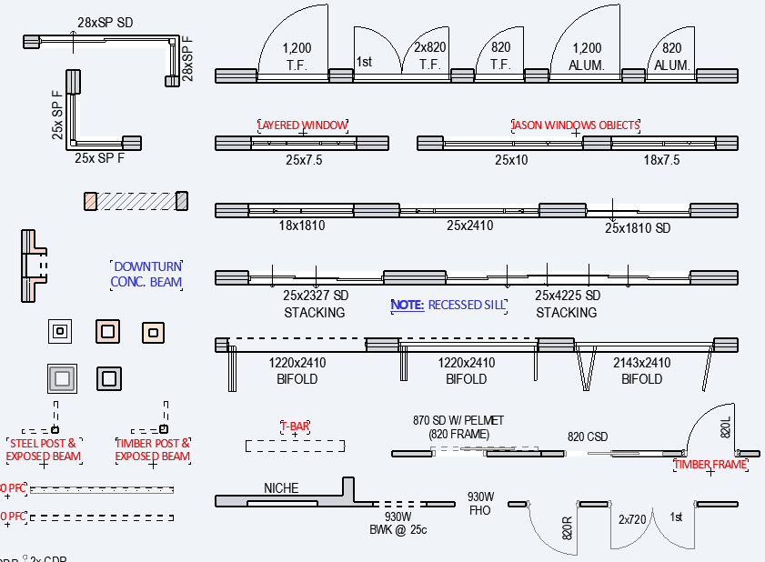
I am currently in the process of migrating my template into AC26 and the first thing I noticed was issues with my font and the way it is displayed on the screen.
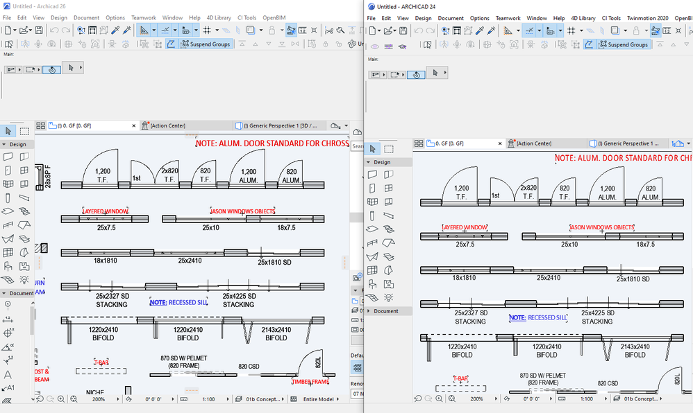
It actually hurts my eyes to look at as the lines and text appear to be thicker / fuzzy when zoomed out. The text is also displaying a lot differently, sort of like it's a foreign font?
To me, the lines and text when viewed in 24 were a lot 'cleaner' and more 'crisp' however this is not the case in the 26. Is there a setting or anything I can adjust?
- Mark as New
- Bookmark
- Subscribe
- Mute
- Subscribe to RSS Feed
- Permalink
- Report Inappropriate Content
2022-08-19 07:54 AM
I have noticed this happening in AC26 with non-orthogonal dimension lines on my 5k mac screen. I have also picked up that fonts aren’t handled the same, like small shifts distorting the text size according to application and font. I haven’t had a chance to test these distortions yet but I agree something has changed and not in a good way.
- Mark as New
- Bookmark
- Subscribe
- Mute
- Subscribe to RSS Feed
- Permalink
- Report Inappropriate Content
2022-08-19 09:42 AM - edited 2022-08-19 09:43 AM
I don't have a hi-res screen so maybe I am not affected so badly.
But there is definitely a different quality in the plans.
The menus, palettes and tool bars don't seem to be affected at all.
The plans are definitely not as crisp and clear.
I did complain about it in Beta testing and GS's response was that 2D ant-aliassing should be turned on by default now.
I have always worked with it off as I like to see the 'jaggy' lines when a wall is not quite horizontal or vertical.
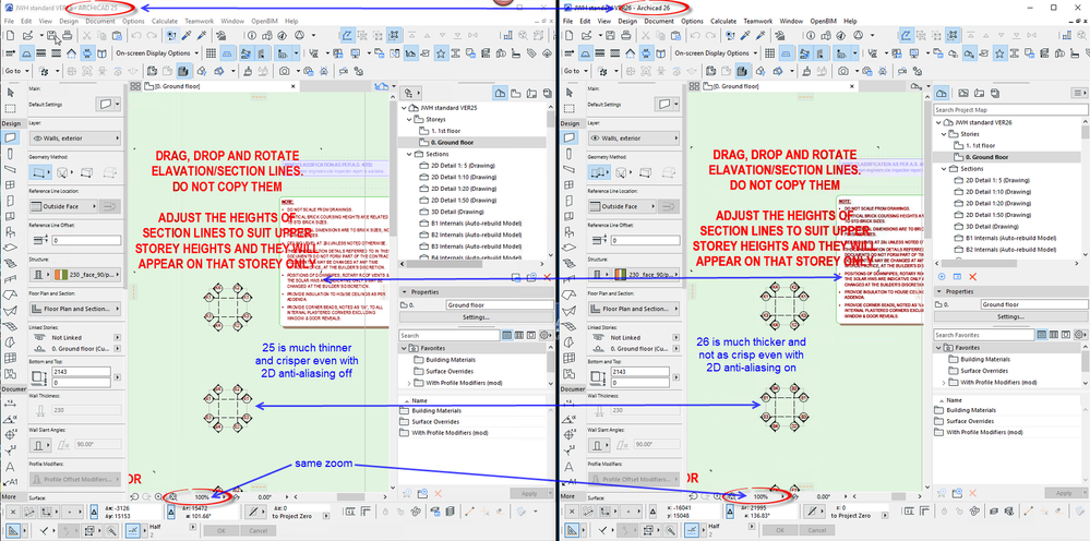
Even with 2D anti-aliassing turned on in 26, it is still not as nice as 25.
In this image it is off in 25 (on the left) and on in 26 (on the right).
It just looks a bit fuzzy now.
Of course it clears up as you zoom in and I am hoping I won't notice it so much when I am not comparing them side by side, but I am really hoping that GS can do something about this sometime soon in the future.
But just the fact that many have noticed this, must mean there is something wrong.
Barry.
Versions 6.5 to 27
i7-10700 @ 2.9Ghz, 32GB ram, GeForce RTX 2060 (6GB), Windows 10
Lenovo Thinkpad - i7-1270P 2.20 GHz, 32GB RAM, Nvidia T550, Windows 11
- Mark as New
- Bookmark
- Subscribe
- Mute
- Subscribe to RSS Feed
- Permalink
- Report Inappropriate Content
2022-08-19 09:44 AM
Hey Barry!
Glad to see it's not just me then. That alone would be enough for me to stay on 25 for a bit longer as my eyes were hurting after 30 minutes, let alone hours on end.
Hopefully they sort it out in the next patch!
- Mark as New
- Bookmark
- Subscribe
- Mute
- Subscribe to RSS Feed
- Permalink
- Report Inappropriate Content
2022-08-19 09:49 AM
Interesting and definitely different. Whilst preview sees it as a font it doesn't know what 'type'
The font image in 26 is heavier. The overall file size is smaller in 24 but has more pixels
you can't build a line
Mac Studio
iPad Pro
iPhone
- Mark as New
- Bookmark
- Subscribe
- Mute
- Subscribe to RSS Feed
- Permalink
- Report Inappropriate Content
2022-08-19 09:51 AM
And I should have said, the image I posted is side by side on the same screen at the same time.
So there is no trickery going on.
I think everyone should make a report to their local Archicad support.
I certainly will be reporting it (again).
Reference back to this post as an example.
Barry.
Versions 6.5 to 27
i7-10700 @ 2.9Ghz, 32GB ram, GeForce RTX 2060 (6GB), Windows 10
Lenovo Thinkpad - i7-1270P 2.20 GHz, 32GB RAM, Nvidia T550, Windows 11
- Mark as New
- Bookmark
- Subscribe
- Mute
- Subscribe to RSS Feed
- Permalink
- Report Inappropriate Content
2022-08-19 09:52 AM - edited 2022-08-19 09:56 AM
Hi David,
I could possibly try to squeeze both 24 and 26 onto the same screen and snap it one go. Would that provide any more information for you?
EDIT: I went ahead and did it anyway. Definitely noticeable side-by-side

- Mark as New
- Bookmark
- Subscribe
- Mute
- Subscribe to RSS Feed
- Permalink
- Report Inappropriate Content
2022-08-19 09:55 AM
Hey Barry,
As a reference, I have done the same thing - both images on the same screen. Definitely noticeable.
- Mark as New
- Bookmark
- Subscribe
- Mute
- Subscribe to RSS Feed
- Permalink
- Report Inappropriate Content
2022-08-19 10:00 AM - edited 2022-08-19 11:21 AM
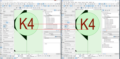
The text is definitely moving - even if only by a little bit.
You can see here by the grey section line in the background.
And this is just Arial Narrow - nothing fancy.
And the font is jaggier in 26 even with 2D anti-aliassing on.
Barry,
Versions 6.5 to 27
i7-10700 @ 2.9Ghz, 32GB ram, GeForce RTX 2060 (6GB), Windows 10
Lenovo Thinkpad - i7-1270P 2.20 GHz, 32GB RAM, Nvidia T550, Windows 11
- Mark as New
- Bookmark
- Subscribe
- Mute
- Subscribe to RSS Feed
- Permalink
- Report Inappropriate Content
2022-08-19 01:10 PM
Thanks for testing. Developers seem to have 'improved' something. I guess its a bug
you can't build a line
Mac Studio
iPad Pro
iPhone
- Custom door leafs and handles not populating the list for selection when Migrating to Global Libary in Libraries & objects
- Custom door leaf displays incorrectly as a flat panel door in a schedule in Project data & BIM
- Wrong 2D visualization for Pocket Door in Libraries & objects
- Property Label 26 pointer display issue in Libraries & objects
- Expression question in Project data & BIM
