- English
- :
- Forum
- :
- Documentation
- :
- The Future of Pen Sets (Make way for Graphic Overr...
- Subscribe to RSS Feed
- Mark Topic as New
- Mark Topic as Read
- Pin this post for me
- Bookmark
- Subscribe to Topic
- Mute
- Printer Friendly Page
- Mark as New
- Bookmark
- Subscribe
- Mute
- Subscribe to RSS Feed
- Permalink
- Report Inappropriate Content
2021-11-15
11:32 PM
- last edited on
2023-05-17
01:15 AM
by
Gordana Radonic
The Future of Pen Sets (Make way for Graphic Overrides)
Up until I think version 20 the primary method of changing the appearance of elements (pens) was through pen sets.
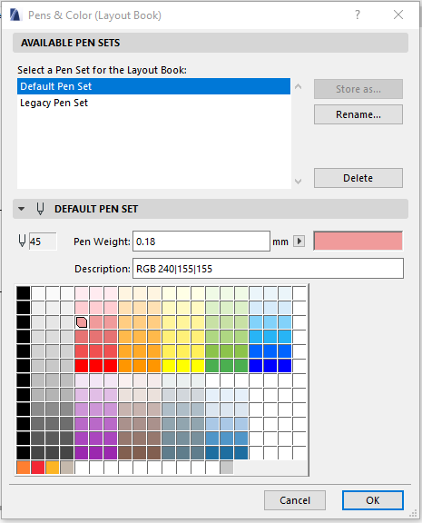
For example, if you wanted the cut line of an element to be .18 in one view and 0.5mm in another, you would assign one of the 255 pens to the element duplicate the penset, in one penset make that pen 0.18, in the other make it 0.5mm.
There needs to be a large number of black pens then, which is why the default penset has the first 150 or so as black 0.18, or similar.
This system works, but doesn't rely on BIM at all as you are manually telling each element which pen to use. If you wanted to check which elements are sanitary elements you could change that pen to green, but that relies on the user assigning that correct pen to the correct elements
With the introduction of Graphic overrides (Archicad 20?), it is possible to work with a more simplified penset, if you want to make all sanitary items green, just create a graphic override that says if the classification is "Sanitaryware" (or whatever the national standard naming is), override the outline to green.
If the element is on the incorrect classification, it doesn't change appearance.
If you want to show all fixtures greyed out with structure black and bold just create a couple of graphic overrides based on classifications or properties.
Curious to hear what people's thoughts are on this.
From what I can tell, Graphic Overrides are underused, when they have the capability to drastically improve the efficiency by which plan appearances and standards are set.
GRAPHISOFT Certified BIM Manager | Senior BIM Specialist | LinkedIn
ARCHICAD 18-28 | BIMcloud | CI Tools | Grasshopper - Rhino | CloudCompare | Bluebeam
Australia & New Zealand
Windows 11 Business | Intel Core i9-13950HX @2.2GHZ | 64Gb RAM | 2x Samsung S27F350 1920x1080 60Hz | Nvidia RTX 4000 Ada Generation Laptop GPU (12Gb)
- Labels:
-
Graphic Overrides
- Mark as New
- Bookmark
- Subscribe
- Mute
- Subscribe to RSS Feed
- Permalink
- Report Inappropriate Content
2021-11-16 03:05 AM
The problem with graphic overrides is they affect the entire element.
You are not just changing one pen or line type.
Your example of the sanitaryware object.
Say it's original form consists of various pen colours and thicknesses.
When you override it, all pen colours will become the same pen colour.
You can't just swap the blue pen for a green one and leave all the other pens in the object/element the same as they were.
Fortunately there is an option to override the pen thickness or not.
This may be perfectly fine for what you want to do, but if you are looking to override just one colour (line type, fill, surface) of an element, you can't with graphic overrides as they work now.
So the Graphic Overrides will need to be worked on so they can override just individual items in a object/element.
Barry.
Versions 6.5 to 27
i7-10700 @ 2.9Ghz, 32GB ram, GeForce RTX 2060 (6GB), Windows 10
Lenovo Thinkpad - i7-1270P 2.20 GHz, 32GB RAM, Nvidia T550, Windows 11
- Mark as New
- Bookmark
- Subscribe
- Mute
- Subscribe to RSS Feed
- Permalink
- Report Inappropriate Content
2021-11-16 03:21 AM
Hi Barry
That's a good point.
My workflow is to set the line weights for all the components using black pens (generally 0.18 - 0.5mm), then for the most part my Graphic overrides are for colour only.
GRAPHISOFT Certified BIM Manager | Senior BIM Specialist | LinkedIn
ARCHICAD 18-28 | BIMcloud | CI Tools | Grasshopper - Rhino | CloudCompare | Bluebeam
Australia & New Zealand
Windows 11 Business | Intel Core i9-13950HX @2.2GHZ | 64Gb RAM | 2x Samsung S27F350 1920x1080 60Hz | Nvidia RTX 4000 Ada Generation Laptop GPU (12Gb)
- Mark as New
- Bookmark
- Subscribe
- Mute
- Subscribe to RSS Feed
- Permalink
- Report Inappropriate Content
2021-11-16 10:24 AM
@Josh Verran 100%. I have been working like this for years, well, ever since GOs were established. I gave up on the pen sets because unless you have a consistent type of work and a good template you can spend hours just managing the pens without actually doing anything of value to the client. I guess it depends what you grew up with, if it was pen & ink your view of AC's Pen Sets is probably very different to someone who hasn't worked with that limitation. We aren't talking full colour local authority presentation here, it's the simple concept of allowing a building trade to orient themselves with the building and highlighting the associated works. That doesn't require 256 different pens, in fact it can be difficult to recognise the difference between 16 colours on site depending on lighting conditions. Combined with View settings I think the GO's do an awesome job for technical drawing presentation and the only thing to improve, aside from some filtering upgrades, would be for AC GOs to be able to assign pens that differentiate between cut, contour & projected lines. I certainly don't see the need for displaying different pen weights & colour within an object; do we really need to be managing 6 different line pens for 2D & 3D Frame, Sash & Glass in a window? If an object is so complex that it shows different elements for different trades that need specifically highlighted then perhaps it needs broken up for BiM compliance & quantities anyway. Put simply 2D plans do not need complex pen settings for technical presentation, just because you can, doesn't mean you should.
- Mark as New
- Bookmark
- Subscribe
- Mute
- Subscribe to RSS Feed
- Permalink
- Report Inappropriate Content
2021-11-16 10:39 AM
I also thought about it, but ended with same reasoniong as Barry Kelly. It is more flexible to use Pen sets combined with Graphic overrides. But this path is not entirely futile and should be explored more.
A quick tought to your pen settings: if the different line weight are the same color, it is more difficult to visually inspect them. Especially when we usually work with the line weight turned off to easy see how the lines join. I prefer to have different colors for diffrent line weights.
www.sieberttalas.com
- Mark as New
- Bookmark
- Subscribe
- Mute
- Subscribe to RSS Feed
- Permalink
- Report Inappropriate Content
2021-11-17 12:54 AM
I agree that using multiple pen sets adds layer of unnecessary confusion and that changing pen colours/weights would be better controlled in one place through graphic overrides, while using just a single pen set.
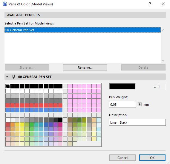
See attached image of a pen set that I use - top left are drafting pens, bottom left fill colours, bottom right landscape/nature colours, and top right (pink) are blank for project specific pens. It works great and provides all required pens. One issue is that Archicad ships with library objects, walls, curtain walls etc. with the thousands of pen settings already setup to match their multiple pen set logic; so applying this single pen set creates a mess of incorrect line colours/weights, and every object needs manually updated to suit.
As mentioned by others, the GO 'Override Style' options are quite limited and for example we can't change 'cut' lines vs 'projected' lines or individual line settings inside of objects. Revit uses a single pen set, with more comprehensive graphic override options, being able to choose 'cut' vs 'projected' and dig down into each line type inside of objects (ie. window sash, wall skin lines, etc.) and it is much simpler to use than using a mix of multiple pen sets/GO's.

Archicad user since 2001
- Mark as New
- Bookmark
- Subscribe
- Mute
- Subscribe to RSS Feed
- Permalink
- Report Inappropriate Content
2021-11-17 01:08 AM
That's similar to the one we use.
We've been using for a couple of years now and haven't had any issue.
With regards to being able to check line weights, we haven't really had a problem with that.
We toggle between true line weight on/off, if unsure then it probably doesn't matter.
GRAPHISOFT Certified BIM Manager | Senior BIM Specialist | LinkedIn
ARCHICAD 18-28 | BIMcloud | CI Tools | Grasshopper - Rhino | CloudCompare | Bluebeam
Australia & New Zealand
Windows 11 Business | Intel Core i9-13950HX @2.2GHZ | 64Gb RAM | 2x Samsung S27F350 1920x1080 60Hz | Nvidia RTX 4000 Ada Generation Laptop GPU (12Gb)
- Mark as New
- Bookmark
- Subscribe
- Mute
- Subscribe to RSS Feed
- Permalink
- Report Inappropriate Content
2021-11-18 09:30 AM
I agree that option to differentiate between cut, contour & projected line in GO would solve most of the problems.
We use differrent pen set for actual work in project (wher we have different color for different line weigth and different object group - steel, MEP, furniture...) and different one for printing. We have more pen sets for printing and publishing, they change according to the purpose of the drawing. The control of the color of the lines through the pen sets is clearer, you see in the set which color will be what colour. In GO´s it is a bit opaque. But I don't see this as an obstacle.
Another story are Drawings inserted in to model space, you can controle dose only with Pen sets.
www.sieberttalas.com
- Mark as New
- Bookmark
- Subscribe
- Mute
- Subscribe to RSS Feed
- Permalink
- Report Inappropriate Content
2021-11-22 10:51 PM - edited 2021-11-22 11:07 PM
Not that anyone would be very interested in this pen set but I thought there might be some ideas in it that could be useful to someone creating a new pen set.
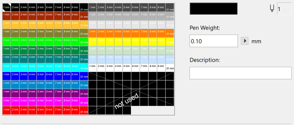
The mm is my frame of reference for pens which is based on pre-historic HP and CalComp Pen Plotters, Rapidograph Pens, Pentel... Pt sizes, like Metric units, are not something I relate to without having to stop and think about it. For that reason, I have set up the pen sizes in Columns from left to right starting with .1mm as shown below. The colors mean nothing. I use Columns 10 and 20 for Hairline ( .01 mm) I rarely use more than about 5 or 6 pens for a project, and that includes colored pens too.
I do this for (2) main reasons:
1. I use Archicad for more than just generating Working Drawings for Buildings, and so did my kids who used Archicad quite a lot for homework projects, they liked having more colors. The little one would always tell me... "make it pink Daddy. Make it pink!" My little ArchiGURU is 30 years old now. Wasting her life away working on teeth all day instead of Buildings 😞. So sad. I also use colors from time to time when I am making line drawings on a Photo or other color images in the projects. Colors can be useful for all sorts of things.
2. I can know just by seeing the pen number what the size of the pen is. Because of the Standard pens pallet being (20) columns wide, the last number of any pen (if you set up the pens per columns as shown) - tells the size of that pen.
Pen 1 = .1mm
Pen 143 = .3mm
Pen 15 = .5mm
Pen 208 = .8mm
Pen 82 = .2 mm .... you get the idea. I do this because otherwise I have no idea what size a certain pen number is. I have been using this one pen set for more than 27 years now and I have never thought I might like to use another one.
ArchiCAD 25 7000 USA - Windows 10 Pro 64x - Dell 7720 64 GB 2400MHz ECC - Xeon E3 1535M v6 4.20GHz - (2) 1TB M.2 PCIe Class 50 SSD's - 17.3" UHD IPS (3840x2160) - Nvidia Quadro P5000 16GB GDDR5 - Maxwell Studio/Render 5.2.1.49- Multilight 2 - Adobe Acrobat Pro - ArchiCAD 6 -25
- Mark as New
- Bookmark
- Subscribe
- Mute
- Subscribe to RSS Feed
- Permalink
- Report Inappropriate Content
2021-11-22 11:15 PM
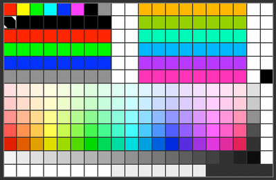
Here's my variant with Pen weights in each colour increasing from left to right from 0.18 to 2.0 in old ink pen sizes. I do like to add some shading as part of my highlighting, so there is a range of colours for that as well.
The top left line is a legacy from my early cad days when we had 640 x 480px monitors with limited colours... 🙈
Still looking?
- Unable to edit overide in "Ci tools Doors _ Schedule" Object - Door and Window Schedule all Dashed in Libraries & objects
- Design options with graphic overrides in Documentation
- Skin Separators and Fills in Graphic Overrides in Documentation
- hiding specific elements of a composite wall in Visualization
- Archicad 2D – A Lightweight Drafting Tool for a Wider Audience? in General discussions


