- English
- :
- Forum
- :
- Installation & update
- :
- MacOS Dark Mode
- Subscribe to RSS Feed
- Mark Topic as New
- Mark Topic as Read
- Pin this post for me
- Bookmark
- Subscribe to Topic
- Mute
- Printer Friendly Page
- Mark as New
- Bookmark
- Subscribe
- Mute
- Subscribe to RSS Feed
- Permalink
- Report Inappropriate Content
2021-12-17 12:12 AM
MacOS Dark Mode
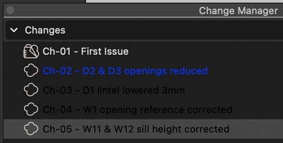
Are we ever likely to see a Dark Mode that doesn't generate difficult to read graphics like this...
The blue is bad enough but black on dark grey (lines 3 & 4) is nearly impossible to read.
- Mark as New
- Bookmark
- Subscribe
- Mute
- Subscribe to RSS Feed
- Permalink
- Report Inappropriate Content
2021-12-17 06:40 AM
It's great on Windows lolol
- Mark as New
- Bookmark
- Subscribe
- Mute
- Subscribe to RSS Feed
- Permalink
- Report Inappropriate Content
2021-12-17 10:22 AM
To be fair, I don't think light mode is that great on either platform. Ever since somebody decided colour wasn't an important part of icon identification AC has been visually painful to use.
- Mark as New
- Bookmark
- Subscribe
- Mute
- Subscribe to RSS Feed
- Permalink
- Report Inappropriate Content
2021-12-17 04:36 PM
Agreed
- Mark as New
- Bookmark
- Subscribe
- Mute
- Subscribe to RSS Feed
- Permalink
- Report Inappropriate Content
2022-02-19 12:49 PM
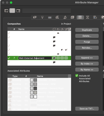
In Attribute Manager, it is even worse, since the introduction of Dark Mode.
@GS: Please nail this nasty bug. Thanks.

- Mark as New
- Bookmark
- Subscribe
- Mute
- Subscribe to RSS Feed
- Permalink
- Report Inappropriate Content
2022-03-30 03:29 PM
As my Q. didn't raise a response at the User Group Seminar I'll share it here...
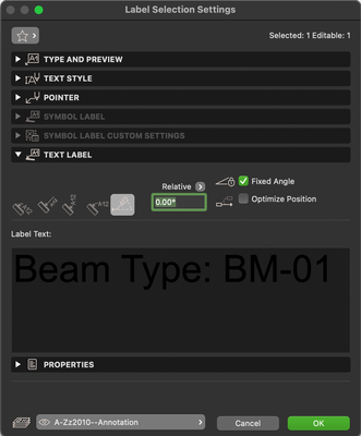
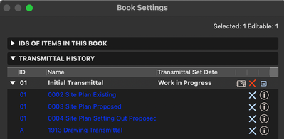
The MacOS UI graphics are a mess & in places difficult to use. Dark Mode graphics issues have been reported multiple times over the last three years and the lack of action reflects badly on the software. When can we expect an interface that doesn’t include black text on dark grey background etc?
And please don’t blame resources, we were switched from bitmap to monochrome vector icons quick enough in AC20 - 2016.
- Mark as New
- Bookmark
- Subscribe
- Mute
- Subscribe to RSS Feed
- Permalink
- Report Inappropriate Content
2022-04-03 11:48 PM
Can you post example screenshots of this?
AMD Ryzen9 5900X CPU, 64 GB RAM 3600 MHz, Nvidia GTX 1060 6GB, 500 GB NVMe SSD
2x28" (2560x1440), Windows 10 PRO ENG, Ac20-Ac29
- Mark as New
- Bookmark
- Subscribe
- Mute
- Subscribe to RSS Feed
- Permalink
- Report Inappropriate Content
2022-04-04 12:40 AM
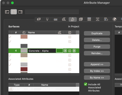
@Laszlo Nagy Here's a few that require improvement. There's probably others in dialogs I don't normally use...




- Mark as New
- Bookmark
- Subscribe
- Mute
- Subscribe to RSS Feed
- Permalink
- Report Inappropriate Content
2022-04-04 01:01 AM
OK, I will forward these to Graphisoft.
AMD Ryzen9 5900X CPU, 64 GB RAM 3600 MHz, Nvidia GTX 1060 6GB, 500 GB NVMe SSD
2x28" (2560x1440), Windows 10 PRO ENG, Ac20-Ac29
Still looking?
- AC28 extremely laggy when in MacOS dark mode in Installation & update
- Demo Mode & Write Protection in Licensing
- macOS arm - full screen mode - tracker and coordinate input in Modeling
- What is the Dark vs Light Icon in view map meaning in Documentation
- Licensing with command line parameters EDU license not working Archicad 27 in Licensing
