
Turn on suggestions
Auto-suggest helps you quickly narrow down your search results by suggesting possible matches as you type.
Showing results for
EN
Turn on suggestions
Auto-suggest helps you quickly narrow down your search results by suggesting possible matches as you type.
Showing results for
- English
- :
- Forum
- :
- Installation & update
- :
- Text Font Alignment and Formatting
Options
- Subscribe to RSS Feed
- Mark Topic as New
- Mark Topic as Read
- Pin this post for me
- Bookmark
- Subscribe to Topic
- Mute
- Printer Friendly Page
Anonymous
Not applicable
Options
- Mark as New
- Bookmark
- Subscribe
- Mute
- Subscribe to RSS Feed
- Permalink
- Report Inappropriate Content
2012-01-15 11:08 AM
Text Font Alignment and Formatting
2012-01-15
11:08 AM
With Myriad Pro for example the spacing under the letter changes dramatically. It shifts all the letters up. This also happen with other fonts depending on what is used. I understand Graphisoft may not have the time to ensure every font choice works as it should but this is a system font and in my opinion much easier on the eyes than Arial.
Is there a way to fix this application wide? I know that with section/elevation markers the text can be shifted separate to the marker geometry, but that's another frustrating step and it doesn't address the root of the problem.
Is this something Graphisoft can fix or would another (drastic) solution be to use a font editing software to change the actual font?
Image attached to explain the way this looks side by side

Read-Only
Labels:
- Labels:
-
Performance
10 Replies 10
Karl Ottenstein
Moderator Emeritus
Options
- Mark as New
- Bookmark
- Subscribe
- Mute
- Subscribe to RSS Feed
- Permalink
- Report Inappropriate Content
2012-01-15 07:04 PM
2012-01-15
07:04 PM
Specs please - always include in your post (ideally in your profile footer): what version of AC and what OS platform?
Vote for Wish: Copy/Paste in 3D
AC 29 USA and earlier • hardware key • macOS Tahoe 26.5.2 MacBook Pro M2 Max 12CPU/30GPU cores, 32GB
AC 29 USA and earlier • hardware key • macOS Tahoe 26.5.2 MacBook Pro M2 Max 12CPU/30GPU cores, 32GB
Karl Ottenstein
Moderator Emeritus
Options
- Mark as New
- Bookmark
- Subscribe
- Mute
- Subscribe to RSS Feed
- Permalink
- Report Inappropriate Content
2012-01-15 07:19 PM
2012-01-15
07:19 PM
Just checked on my Mac and see the same thing you do. There was some discussion of this a few years back and I cannot recall the outcome.
What I see in AC 15 on 10.7.2 is that Myriad Pro is an Opentype / Postscript font but that Arial is an Opentype / TrueType font.
My system has an Adobe font called Myriad Web Pro which is an Opentype / TrueType font and its size and alignment are identical to Arial. (Size: "M" graphic heights equal each other and relative position inside the text handles is the same.)
I tried several other PostScript fonts (Arno, Chaparral, etc.) and they have the same vertical positioning issue.
So, either it is a system issue with PostScript fonts on the OS side not reporting their font metrics correctly to applications (ArchiCAD) or a Graphisoft issue of not positioning the font baseline properly for PostScript fonts...
Karl
Edit: PS I just tried Myriad Pro, Myriad Web Pro and Arial "M" characters adjacent to one another in Word (2008/Mac) and the baselines all align - and, strangely, there the M-size of Myriad Web Pro matches Myriad Pro, which is shorter than an Arial "M". Seems to me that if Word is able to read the font metrics, that ArchiCAD should be able to and that this must be a bug on Graphisoft's side. Will report after others chime in ... hopefully someone else remembers the old discussion of this same issue...
Vote for Wish: Copy/Paste in 3D
AC 29 USA and earlier • hardware key • macOS Tahoe 26.5.2 MacBook Pro M2 Max 12CPU/30GPU cores, 32GB
AC 29 USA and earlier • hardware key • macOS Tahoe 26.5.2 MacBook Pro M2 Max 12CPU/30GPU cores, 32GB
Anonymous
Not applicable
Options
- Mark as New
- Bookmark
- Subscribe
- Mute
- Subscribe to RSS Feed
- Permalink
- Report Inappropriate Content
2012-01-16 01:36 AM
2012-01-16
01:36 AM
Thanks Karl
Good investigation, appreciated. I'll have a look at Myriad Web Pro. And yes, I've never found a problem with other software reading that font or others.
Specs in signature now
Good investigation, appreciated. I'll have a look at Myriad Web Pro. And yes, I've never found a problem with other software reading that font or others.
Specs in signature now
Eduardo Rolon
Moderator
Options
- Mark as New
- Bookmark
- Subscribe
- Mute
- Subscribe to RSS Feed
- Permalink
- Report Inappropriate Content
2012-01-16 03:18 AM
2012-01-16
03:18 AM
This has been my pet problem for a long time. Different fonts, different base lines and they sometimes move based on AC Release or Update.
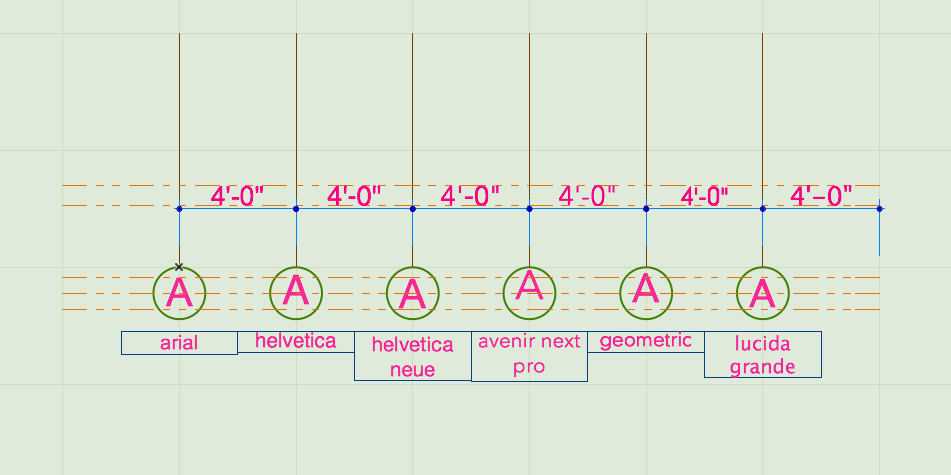
Attached is an example were the Dimensions ignore the base lines therefore all match regardless of font type while the Grid Lines do not.
This is not necessarily AC's fault the base lines also move in Apple Apps.
Attached is an example were the Dimensions ignore the base lines therefore all match regardless of font type while the Grid Lines do not.
This is not necessarily AC's fault the base lines also move in Apple Apps.
Eduardo Rolón AIA NCARB
AC29 US/INT -> AC08
AC29 US/INT -> AC08
Mac Studio M4 Max 64GB ram, OS X 10.XX latest
Anonymous
Not applicable
Options
- Mark as New
- Bookmark
- Subscribe
- Mute
- Subscribe to RSS Feed
- Permalink
- Report Inappropriate Content
2012-01-16 03:33 AM
Anonymous
Not applicable
Options
- Mark as New
- Bookmark
- Subscribe
- Mute
- Subscribe to RSS Feed
- Permalink
- Report Inappropriate Content
2012-01-16 03:49 AM
2012-01-16
03:49 AM
You are correct again that in Apple's Pages, the base line is also different. I guess I never noticed it because it doesn't usually have to align with anything so accurately. (Screenshot attached)
And in looking at Adobe Illustrator there's only a micron difference between Arial and Myriad Pro. Not enough to call a problem.
I'd love to solve it, I fear that if I can't I'll throw my hands up in despair and resort to using comic sans for all documentation!

And in looking at Adobe Illustrator there's only a micron difference between Arial and Myriad Pro. Not enough to call a problem.
I'd love to solve it, I fear that if I can't I'll throw my hands up in despair and resort to using comic sans for all documentation!
Graphisoft Alumni
Options
- Mark as New
- Bookmark
- Subscribe
- Mute
- Subscribe to RSS Feed
- Permalink
- Report Inappropriate Content
2012-02-23 01:24 PM
2012-02-23
01:24 PM
Dear Matt,
I was glad to read your remark about font positions. There are some things which are good to know about the issue:
This behavior of texts is not really ArchiCAD specific. It happens because fonts can have different ascent, descent, leading values resulting even if they have the same nominal size (e.g. 12 pt, 10 mm) they can appear in different size and in a different position in the textbox having different line spacing.
You can check this in TextEdit as well. In the attached screenshot all of the three fonts are set to the same (48 pt) size. If you zoom into the image you will see that each font has a different size and position. (By the way, Myriad Pro is not a default system font on Mac. Please find the list of the default fonts here:http://en.wikipedia.org/wiki/List_of_typefaces_included_with_Mac_OS_X )
I hope this description contains the answer to your questions.
Regards,
I was glad to read your remark about font positions. There are some things which are good to know about the issue:
This behavior of texts is not really ArchiCAD specific. It happens because fonts can have different ascent, descent, leading values resulting even if they have the same nominal size (e.g. 12 pt, 10 mm) they can appear in different size and in a different position in the textbox having different line spacing.
You can check this in TextEdit as well. In the attached screenshot all of the three fonts are set to the same (48 pt) size. If you zoom into the image you will see that each font has a different size and position. (By the way, Myriad Pro is not a default system font on Mac. Please find the list of the default fonts here:
I hope this description contains the answer to your questions.
Regards,
Katalin Takacs
Eduardo Rolon
Moderator
Options
- Mark as New
- Bookmark
- Subscribe
- Mute
- Subscribe to RSS Feed
- Permalink
- Report Inappropriate Content
2012-02-23 01:41 PM
2012-02-23
01:41 PM
Hello Katalin,
The main problem is not the finding the reason. The main problem is that depending of the tool used in AC the fonts behave differently.
For example:
1. For dimensions AC does not take in consideration the baseline therefore it does not matter which font I use it will keep its position. (Until a new version of AC changes it).
2. Drawing Titles take in consideration the fonts baseline but you have the option of moving the text so it displays correctly.
3. For Grids, Schedules, Elevations, Sections, Labels, etc, AC will move the font according to its baseline and there is no option to adjust it. And sometimes the displacement is different based on the tool not the font (i.e. One font will display correctly in the Grid tool but it will not in the Elevation tool).
-----
What I would like is for AC to handle Fonts with a combination of 1 and 2 on all tools that display text.
Eduardo Rolón AIA NCARB
AC29 US/INT -> AC08
AC29 US/INT -> AC08
Mac Studio M4 Max 64GB ram, OS X 10.XX latest
Anonymous
Not applicable
Options
- Mark as New
- Bookmark
- Subscribe
- Mute
- Subscribe to RSS Feed
- Permalink
- Report Inappropriate Content
2012-02-23 02:23 PM
2012-02-23
02:23 PM
Hi Katallin
Thanks for the response. My apology, I thought I checked to see if I was correct in saying Myriad Pro is a system font. It turns out you're right, it's not. But it nearly is, by that I mean it's installed by default when you install Adobe Photoshop or similar. And it's fair to say that a computer without Photoshop is barely a computer!
Ejrolon is all over this, and it seems has been dealing with the gnawing inconvenience much longer than I. Poor bugger. I agree, knowing the reason is not the answer, merely a breadcrumb on the path to finding a resolution. I'd also agree that the suggestions proposed for a fix are the way it should be. And to add to that, if you manually adjust the text to sit where you want it and then this (Drawing title or whatever) is saved as a favourite, then that new position is saved as well. So that it only has to be moved once and then becomes part of your template — I think this is actually what happens with the drawing title. So when you eye drop from one drawing to the next it copies all adjustments.
Ideally though, all fonts would just work as they do on the dimension lines.
I realise it might be a little bit of work to have all 40 million fonts in the world work perfectly. Maybe I can just put in a special request for Myriad Pro I know Graphisoft has much respect for the late Steve Jobs. I think he would have loved to see it working flawlessly on his lovely machine. In fact Apple have made use of this font family for a number of years. It seems a shame to not have this particular font work as it should.
Thanks for the response. My apology, I thought I checked to see if I was correct in saying Myriad Pro is a system font. It turns out you're right, it's not. But it nearly is, by that I mean it's installed by default when you install Adobe Photoshop or similar. And it's fair to say that a computer without Photoshop is barely a computer!
Ejrolon is all over this, and it seems has been dealing with the gnawing inconvenience much longer than I. Poor bugger. I agree, knowing the reason is not the answer, merely a breadcrumb on the path to finding a resolution. I'd also agree that the suggestions proposed for a fix are the way it should be. And to add to that, if you manually adjust the text to sit where you want it and then this (Drawing title or whatever) is saved as a favourite, then that new position is saved as well. So that it only has to be moved once and then becomes part of your template — I think this is actually what happens with the drawing title. So when you eye drop from one drawing to the next it copies all adjustments.
Ideally though, all fonts would just work as they do on the dimension lines.
I realise it might be a little bit of work to have all 40 million fonts in the world work perfectly. Maybe I can just put in a special request for Myriad Pro
Still looking?
