- Subscribe to RSS Feed
- Mark Topic as New
- Mark Topic as Read
- Pin this post for me
- Bookmark
- Subscribe to Topic
- Mute
- Printer Friendly Page
- Mark as New
- Bookmark
- Subscribe
- Mute
- Subscribe to RSS Feed
- Permalink
- Report Inappropriate Content
2022-07-23 08:41 AM - edited 2022-07-23 09:07 AM
Surface Picker
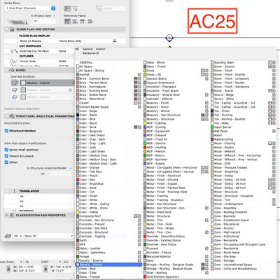
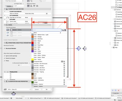
Not really sure what to say here... the screen captures say it all:
I believe this is what we have to look forward to in future versions. There has been a devolving of the GUI over the past years, and this one is egregious. I'm not sure who is driving the car at GS when it comes to making these decisions, but they've gone off the road.
I present to you, the Surface attribute picker in 26 vs. 25... Happy scrolling!
ArchiCAD 28/29 (user since 3.4, 1991)
16" MacBook Pro; M4 Max (2024), 48GB RAM, 1 TB SSD, 32-Core GPU
Apple Vision Pro w/ BIMx
Creator of the Maximilian ArchiCAD Template System
- Mark as New
- Bookmark
- Subscribe
- Mute
- Subscribe to RSS Feed
- Permalink
- Report Inappropriate Content
2022-07-24 03:46 PM
This culture of ignorance and illusion has reigned at Graphisoft for a long time. It is sometimes supported by some users. It is on this basis that the company wants to continue to ignore sensible proposals for Archicad 26.
AC 10-28 (Full)
Asus | 64 GB RAM | Windows 11
- Mark as New
- Bookmark
- Subscribe
- Mute
- Subscribe to RSS Feed
- Permalink
- Report Inappropriate Content
2022-07-24 11:45 PM
I know where every single material resides in the large pop up from months and years of using the attributes. Clicking on the picker, then quickly clicking on the surface takes a second, or two at most. I fear scrolling will waste time like never before... even pausing to type a few letters of the surface will be time consuming when multiplied by the many times we will do it daily.
A really big failing for its users by GS here.
ArchiCAD 28/29 (user since 3.4, 1991)
16" MacBook Pro; M4 Max (2024), 48GB RAM, 1 TB SSD, 32-Core GPU
Apple Vision Pro w/ BIMx
Creator of the Maximilian ArchiCAD Template System
- Mark as New
- Bookmark
- Subscribe
- Mute
- Subscribe to RSS Feed
- Permalink
- Report Inappropriate Content
2022-07-25 06:08 AM
Don't fear, it is true.
AC29 US/INT -> AC08
Mac Studio M4 Max 64GB ram, OS X 10.XX latest
another Moderator
- Mark as New
- Bookmark
- Subscribe
- Mute
- Subscribe to RSS Feed
- Permalink
- Report Inappropriate Content
2022-08-05 11:25 AM
New Archicad 26 Build 3010 on August 4. No changes here. Still has the truncated surfaces list.
ArchiCAD 28/29 (user since 3.4, 1991)
16" MacBook Pro; M4 Max (2024), 48GB RAM, 1 TB SSD, 32-Core GPU
Apple Vision Pro w/ BIMx
Creator of the Maximilian ArchiCAD Template System
- « Previous
-
- 1
- 2
- Next »
- « Previous
-
- 1
- 2
- Next »
Still looking?
- I’m experiencing an issue with my template after upgrading from Archicad 26 to Archicad 29. in Libraries & objects
- Archicad 3D model export to CATT acoustic software in Collaboration with other software
- Crashing while opening, changing or reloading elevations in Modeling
- Teamwork and Enscape - Constantly updating Surfaces in Visualization
- Building Materials and texture in Modeling


