- English
- :
- Forum
- :
- Documentation
- :
- Elevation Style Showcase
- Subscribe to RSS Feed
- Mark Topic as New
- Mark Topic as Read
- Pin this post for me
- Bookmark
- Subscribe to Topic
- Mute
- Printer Friendly Page
- Mark as New
- Bookmark
- Subscribe
- Mute
- Subscribe to RSS Feed
- Permalink
- Report Inappropriate Content
2021-12-20
10:12 PM
- last edited on
2023-05-17
03:00 PM
by
Gordana Radonic
Elevation Style Showcase
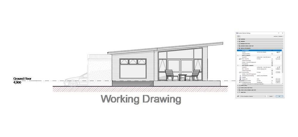
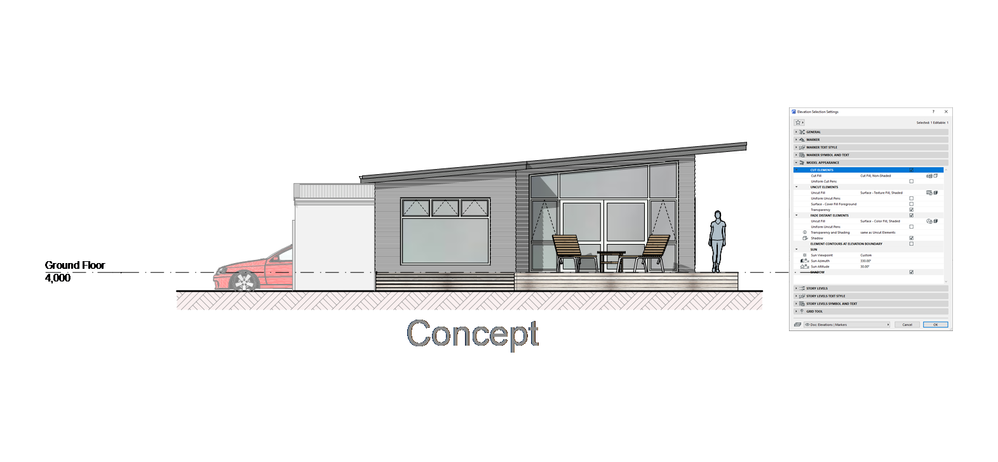
Apologies if there has already been a post similar to this, but curious to see what elevation styles people use around the globe. Below are a couple of examples that I use, it's not a real project, more just enough elements to show use of colour, hatches etc.

GRAPHISOFT Certified BIM Manager | Senior BIM Specialist | LinkedIn
ARCHICAD 18-28 | BIMcloud | CI Tools | Grasshopper - Rhino | CloudCompare | Bluebeam
Australia & New Zealand
Windows 11 Business | Intel Core i9-13950HX @2.2GHZ | 64Gb RAM | 2x Samsung S27F350 1920x1080 60Hz | Nvidia RTX 4000 Ada Generation Laptop GPU (12Gb)
- Labels:
-
Elevations
- Mark as New
- Bookmark
- Subscribe
- Mute
- Subscribe to RSS Feed
- Permalink
- Report Inappropriate Content
2021-12-21 09:33 AM
Hello Josh Verran,
In France about dwellings, below a sample all in black and white because more practical for reprography and graphically more impactful (automatic labels on windows and shadow stripe hatches).
- Mark as New
- Bookmark
- Subscribe
- Mute
- Subscribe to RSS Feed
- Permalink
- Report Inappropriate Content
2021-12-21 10:33 AM
@Josh Verran You might have seen a better response if we could assign Styles to Views rather than the current restrictive workflow of assigning a single style to each Elevation/Section marker. I would imagine for many, that assigning multiple markers to the same elevation to display different graphic styles is reserved for well paid or managed projects. Placing a single marker and making it work using GOs for as many views as needed is possibly the default option.
- Mark as New
- Bookmark
- Subscribe
- Mute
- Subscribe to RSS Feed
- Permalink
- Report Inappropriate Content
2021-12-21 07:37 PM
Nice! I like the hatch you have chosen for shadows.
GRAPHISOFT Certified BIM Manager | Senior BIM Specialist | LinkedIn
ARCHICAD 18-28 | BIMcloud | CI Tools | Grasshopper - Rhino | CloudCompare | Bluebeam
Australia & New Zealand
Windows 11 Business | Intel Core i9-13950HX @2.2GHZ | 64Gb RAM | 2x Samsung S27F350 1920x1080 60Hz | Nvidia RTX 4000 Ada Generation Laptop GPU (12Gb)
- Mark as New
- Bookmark
- Subscribe
- Mute
- Subscribe to RSS Feed
- Permalink
- Report Inappropriate Content
2021-12-21 07:39 PM
Yeah I've tried a few methods, one marker two Graphic Override Combinations, but found I couldn't quite get what I was after. Tried two different markers but then one would get altered (extents) and staff would wonder why the other hadn't updated.
Have settled now for one marker, but have a favourite setup for BnW and another for Colour.
GRAPHISOFT Certified BIM Manager | Senior BIM Specialist | LinkedIn
ARCHICAD 18-28 | BIMcloud | CI Tools | Grasshopper - Rhino | CloudCompare | Bluebeam
Australia & New Zealand
Windows 11 Business | Intel Core i9-13950HX @2.2GHZ | 64Gb RAM | 2x Samsung S27F350 1920x1080 60Hz | Nvidia RTX 4000 Ada Generation Laptop GPU (12Gb)
Still looking?
- [ LONG POST ] - I'm a new user, hoping to ask if ArchiCAD is the best program for my use-case. in General discussions
- Some unclear details about the zone stamps in Documentation
- Pen type not changing on cover fill in Modeling
- Display order 2D and 3D elements not consistent between different teamwork clients in Teamwork & BIMcloud

