- English
- :
- Forum
- :
- Documentation
- :
- Re: Fonts in Archicad Show Incorrectly
- Subscribe to RSS Feed
- Mark Topic as New
- Mark Topic as Read
- Pin this post for me
- Bookmark
- Subscribe to Topic
- Mute
- Printer Friendly Page
- Mark as New
- Bookmark
- Subscribe
- Mute
- Subscribe to RSS Feed
- Permalink
- Report Inappropriate Content
2022-07-15 06:57 PM
Fonts in Archicad Show Incorrectly
Hello,
I have been reading in variety of forums to try and get to the bottom of this, but I am growing weary. My issue is that we have installed a custom font that we use for marketing/branding purposes in our program, but it is not displaying true (true with reference to how Adobe programs display the same font ex. Illustrator/Indesign). The font is in ".oft" formatting. I am not sure if this is the issue as I couldn't find any information on whether or not Archicad had a preference to this. I had also tried to convert it to ".tff", but it didn't matter. The font is not missing (it does not show like this [font] ). The only way I could get it to match exactly was by using was by adjusting the spacing in Archicad and stretching the font slightly... this is not ideal. If I change the font point size I would have to readjust these numbers with a reference PDF with the actual font as reference.
We use Windows 10.
Any thoughts are appreciated.

Solved! Go to Solution.
Accepted Solutions
- Mark as New
- Bookmark
- Subscribe
- Mute
- Subscribe to RSS Feed
- Permalink
- Report Inappropriate Content
2022-07-20 03:33 AM
Might the issue be related to this thread?
| AC22-29 AUS 3200 | Help Those Help You - Add a Signature |
| Self-taught, bend it till it breaks | Creating a Thread |
| Win11 | i9 10850K | 64GB | RX6600 | Win11 | R5 2600 | 16GB | GTX1660 |
- Mark as New
- Bookmark
- Subscribe
- Mute
- Subscribe to RSS Feed
- Permalink
- Report Inappropriate Content
2022-07-16 12:41 AM - edited 2022-07-16 12:43 AM
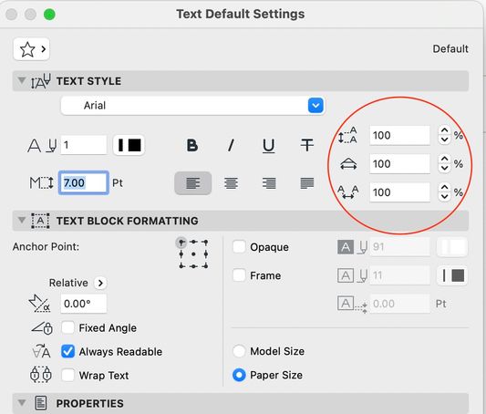
Hi. A similar question was asked recently. Barry pointed out in his response there that some of the text settings are not visible in the editing/formatting bar shown in your screenshot. You have to look at the Text Tool settings themselves - attached screenshot. In your case, make sure that all of the circled settings are set to 100%. Note that if you do want to use these settings to change kerning etc... they are % values ... and so you would not need to readjust anything for different point sizes.
Any new text placed in a project uses the last-set values in the Text Tool... so it is worth checking these settings from time to time. In the case of already-placed text, select the text, then press ctrl-T / cmd-T to bring up the settings dialog to correct the settings.
AC 29 USA and earlier • hardware key • macOS Taho 26.5 MacBook Pro M2 Max 12CPU/30GPU cores, 32GB
- Mark as New
- Bookmark
- Subscribe
- Mute
- Subscribe to RSS Feed
- Permalink
- Report Inappropriate Content
2022-07-18 05:44 PM
Hello Karl,
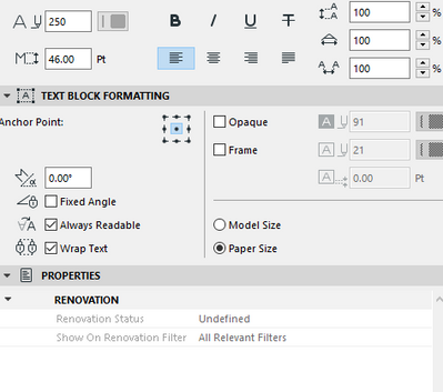
I had manually adjusted the font for those values in order to match the marketing PDF I was referencing. I loaded in the PDF to scale that was exported from Illustrator into the layout space to work on top of to ensure it matches.
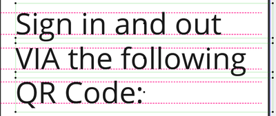
After further investigation I believe the issue it with the text tool itself. See below:
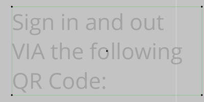
The text does not sit perfectly in the text box. Is there a way to fix this? The spacing between the rows of text is also not accurate.
Thank you for the help.
- Mark as New
- Bookmark
- Subscribe
- Mute
- Subscribe to RSS Feed
- Permalink
- Report Inappropriate Content
2022-07-19 03:51 AM
Without a reference, it is a bit hard to tell what the issue is... Screenshot with your PDF import visible?
| AC22-29 AUS 3200 | Help Those Help You - Add a Signature |
| Self-taught, bend it till it breaks | Creating a Thread |
| Win11 | i9 10850K | 64GB | RX6600 | Win11 | R5 2600 | 16GB | GTX1660 |
- Mark as New
- Bookmark
- Subscribe
- Mute
- Subscribe to RSS Feed
- Permalink
- Report Inappropriate Content
2022-07-19 04:57 AM - edited 2022-07-19 04:59 AM
Interesting, As Ling says, a screenshot of the original PDF next to this would help. It is possible that the problem is the oft font file itself. The typeface file contains “font metrics” which tell the app how to display the font… and the fact that the text extends beyond the text tool box suggests to me that there is a bug in the oft font file itself.
Open the font in a font viewer which may give you the year the font file was created. There may be a newer version available.
if you use this font in Microsoft Word, any Adobe app, and some other apps from unique manufacturers…. Does it appear the same everywhere except Archicad?
AC 29 USA and earlier • hardware key • macOS Taho 26.5 MacBook Pro M2 Max 12CPU/30GPU cores, 32GB
- Mark as New
- Bookmark
- Subscribe
- Mute
- Subscribe to RSS Feed
- Permalink
- Report Inappropriate Content
2022-07-19 05:38 AM
I am not really seeing any real issues (might be my old eyes!).
Can you point out where the problems are?
Characters all have different spacings and I think it can also depend on which character is next to which in some cases.
Sloping characters like V, W, A, have less space around them due to the angle of the characters (thee is proper terminology but I can't remember what it is).
The text is left justified, which is why there is a space to the right.
The white line is just a background grid line or similar?
The space at the top and bottom of the text box is a little off, but this may just be an Archicad thing.
The spacing between the lines is only very slightly different, but that just may be the images.
Barry.
Versions 6.5 to 27
i7-10700 @ 2.9Ghz, 32GB ram, GeForce RTX 2060 (6GB), Windows 10
Lenovo Thinkpad - i7-1270P 2.20 GHz, 32GB RAM, Nvidia T550, Windows 11
- Mark as New
- Bookmark
- Subscribe
- Mute
- Subscribe to RSS Feed
- Permalink
- Report Inappropriate Content
2022-07-19 04:37 PM
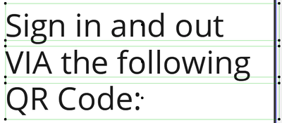
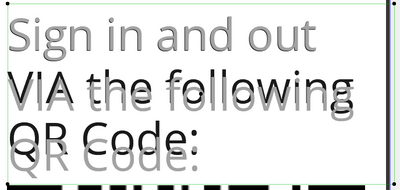
The below shows how I am forced to justify the text manually, if you have ever worked in InDesign, the text box fits perfectly around the text. The light green text box lines in Archicad are offset from the text. They seem to fit flush on the sides, but the top and bottom have a gap.
The grey text below is if I were to keep the text together, in one text box. I have gotten to the bottom of the spacing justification between lines of text. InDesign/Illustrator has the ability to "auto justify" so it automatically fixes spacing to match the font size. Shoudn't a font set to 100% justification perfectly line itself up in lines of text based on the font size? I am starting to wonder if it is the actual font file at this point.
Below is how it shows in InDesign as an example with the blue lines being the text box. Additionally, this is the same Point size of font as above, but for some reason it looks much larger in Archicad. Not a big deal as I can pick font sizes as I need, it is the spacing and justifications that are frustrating to deal with.
InDesign is a much better platform for Marketing related documents, however we have some cross over in our office and when it comes to creating blacklines that are to be used in Marketing documents you start to notice this differences.
- Mark as New
- Bookmark
- Subscribe
- Mute
- Subscribe to RSS Feed
- Permalink
- Report Inappropriate Content
2022-07-20 03:33 AM
Might the issue be related to this thread?
| AC22-29 AUS 3200 | Help Those Help You - Add a Signature |
| Self-taught, bend it till it breaks | Creating a Thread |
| Win11 | i9 10850K | 64GB | RX6600 | Win11 | R5 2600 | 16GB | GTX1660 |
- Mark as New
- Bookmark
- Subscribe
- Mute
- Subscribe to RSS Feed
- Permalink
- Report Inappropriate Content
2022-07-20 05:25 PM
Thank you so much!! I am confident I am experiencing the same issue. I will have to see if we can get the font fixed for ease of use for these marketing documents.
