- Subscribe to RSS Feed
- Mark Topic as New
- Mark Topic as Read
- Pin this post for me
- Bookmark
- Subscribe to Topic
- Mute
- Printer Friendly Page
- Mark as New
- Bookmark
- Subscribe
- Mute
- Subscribe to RSS Feed
- Permalink
- Report Inappropriate Content
2015-01-09 01:39 PM
Annoying Archicad
This is not meant to be a wish list, but a place to tell the devs what where and how Archicad causes frustration while using it (and maybe a place where "bad" behavior can be explained if there is a reason for it).
- Mark as New
- Bookmark
- Subscribe
- Mute
- Subscribe to RSS Feed
- Permalink
- Report Inappropriate Content
2015-01-09 01:48 PM
When I select a group of objects to move to another location, when I select a node it automatically selects a deform command instead of the drag command. 9999 times out of 10000 times I do this I'm looking to drag my group of objects. Once in a blue moon I might need to have multiple objects selected to see a deformation take place but it's almost never.
Everytime I use Archicad this comes up many times each session. It slows me down, adds thinking effort to solve each time which adds to mental fatigue, and it's illogical. Or at least I have yet to find a compelling reason (or any reason) why a deformation command should be default instead of the drag command.
- Mark as New
- Bookmark
- Subscribe
- Mute
- Subscribe to RSS Feed
- Permalink
- Report Inappropriate Content
2015-01-09 02:07 PM
I figure that the box's position is stored with the profile but something is resetting them.
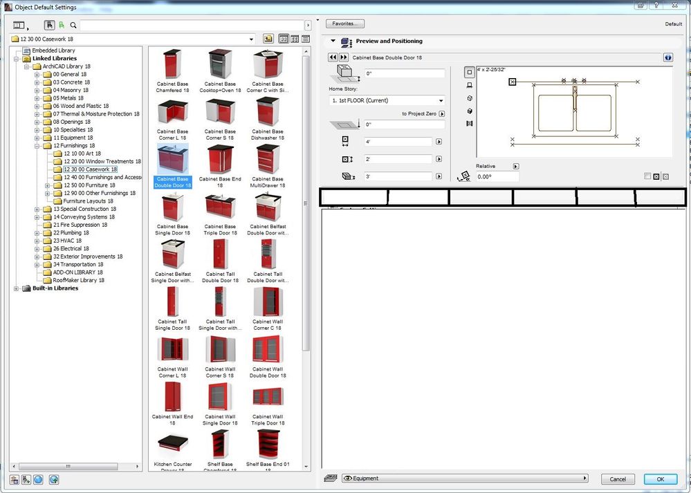
But how those pop up windows are handled besides just frustrates me. Like I can't hit a maximize button to make boxes like layers, or the object setting dialog box full screen in one click instead of having to repositioning the box and hovering twice over the edges to resize.
- Mark as New
- Bookmark
- Subscribe
- Mute
- Subscribe to RSS Feed
- Permalink
- Report Inappropriate Content
2015-01-09 02:26 PM
I'm constantly fiddling with this in a bad way. I would much much much much much much much much rather positioning and preview thingy stay open and the other scrolling tabs are handled as tabs that can be easily switched between in the space under the positioning and preview area. I rarely need to have two of those open (as in I can never remember even once I need two open at the same time). But the

- Mark as New
- Bookmark
- Subscribe
- Mute
- Subscribe to RSS Feed
- Permalink
- Report Inappropriate Content
2015-01-09 02:33 PM
Please just remember this one simple thing when it comes to UI design
Menu Drilling = Bad
Sometimes it's like AC is designed around a 1024x768 screen.

- Mark as New
- Bookmark
- Subscribe
- Mute
- Subscribe to RSS Feed
- Permalink
- Report Inappropriate Content
2015-01-09 02:39 PM
- Mark as New
- Bookmark
- Subscribe
- Mute
- Subscribe to RSS Feed
- Permalink
- Report Inappropriate Content
2015-01-09 02:54 PM
It was much better in the past when I just kind of moved in direction I wanted and hit shift and it would lock. Just simply work.
- Mark as New
- Bookmark
- Subscribe
- Mute
- Subscribe to RSS Feed
- Permalink
- Report Inappropriate Content
2015-01-09 02:57 PM
That ball should not appear under my mouse or over hot spots/nodes.
- Mark as New
- Bookmark
- Subscribe
- Mute
- Subscribe to RSS Feed
- Permalink
- Report Inappropriate Content
2015-01-09 08:24 PM
It's sometimes to easy to slate GS for what in the big scheme of things are just petty frustrations on a truly exceptional expert system. Yes it's not perfect but I don't see anything else out there to tempt me away and AC becomes more useable with each release.
We would all love a system free of bugs that did our job for us but the reality of human errors in the programming will always be a factor until Skynet takes over.
- Mark as New
- Bookmark
- Subscribe
- Mute
- Subscribe to RSS Feed
- Permalink
- Report Inappropriate Content
2015-01-10 02:31 PM
The default storey of any object should be fixed at the current storey when it is first selected. If a user wants to move the object then and only then should they decide to open the object dialog and change the storey.
GeForce GTX 745 4g HP Pavilion 25xw
Windows 10 Archicad 26 USA Full
Still looking?
- After more than three decades with Archicad: has Graphisoft lost touch with professional offices? in General discussions
- Archicad 11 Layout Book File in Documentation
- Archicad lags when I have two or more instances open along with Chrome. in Installation & update
- pdf locking up v29 in Documentation
- Mesh points only from poly lines / lines? in Modeling
