- Subscribe to RSS Feed
- Mark Topic as New
- Mark Topic as Read
- Pin this post for me
- Bookmark
- Subscribe to Topic
- Mute
- Printer Friendly Page
- Mark as New
- Bookmark
- Subscribe
- Mute
- Subscribe to RSS Feed
- Permalink
- Report Inappropriate Content
2022-07-23 08:41 AM - edited 2022-07-23 09:07 AM
Surface Picker
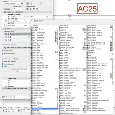
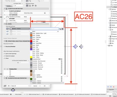
Not really sure what to say here... the screen captures say it all:
I believe this is what we have to look forward to in future versions. There has been a devolving of the GUI over the past years, and this one is egregious. I'm not sure who is driving the car at GS when it comes to making these decisions, but they've gone off the road.
I present to you, the Surface attribute picker in 26 vs. 25... Happy scrolling!
ArchiCAD 28/29 (user since 3.4, 1991)
16" MacBook Pro; M4 Max (2024), 48GB RAM, 1 TB SSD, 32-Core GPU
Apple Vision Pro w/ BIMx
Creator of the Maximilian ArchiCAD Template System
- Mark as New
- Bookmark
- Subscribe
- Mute
- Subscribe to RSS Feed
- Permalink
- Report Inappropriate Content
2022-07-23 03:12 PM
This gives me the impression that the developers who worked for Archicad 26 were hired directly from Autodesk and have had great experience working in the Revit interface...
Archicad is losing its smoothness interface looking at the projected image for the version 26 here.
AC 10-28 (Full)
Asus | 64 GB RAM | Windows 11
- Mark as New
- Bookmark
- Subscribe
- Mute
- Subscribe to RSS Feed
- Permalink
- Report Inappropriate Content
2022-07-23 03:28 PM
Not the only place that they started hiding information.
Reported as a bug, the answer from GS is that now you have search.
The counter answer were IIRC:
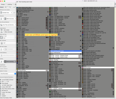
- "We already can highlight the names (see screenshot)"
- "If that is the case, now we need to memorize the names of every single surface, Bmat, layer, etc"
- "Hiding information is bad UI…"
The answer to that was "…we will look into it sometime in the future…"
----
AC29 US/INT -> AC08
Mac Studio M4 Max 64GB ram, OS X 10.XX latest
another Moderator
- Mark as New
- Bookmark
- Subscribe
- Mute
- Subscribe to RSS Feed
- Permalink
- Report Inappropriate Content
2022-07-23 03:39 PM - edited 2022-07-23 05:36 PM
Graphisoft doesn't need to try integrating some part from Revit every year. They could only request Autodesk for authorization to import the complete Revit's interface into Archicad once and for all.
I remind you that the beauty and originality of Archicad resided in its interface. The version 26 has started destroying it.
AC 10-28 (Full)
Asus | 64 GB RAM | Windows 11
- Mark as New
- Bookmark
- Subscribe
- Mute
- Subscribe to RSS Feed
- Permalink
- Report Inappropriate Content
2022-07-23 09:28 PM - edited 2022-07-23 09:32 PM
this is really worrying. Its one of the things i liked a lot about Archicad, this extended menu where you could see all your info at once. One of the problems i always see of software companies is this penchant of inovating for the sake of inovating, or its just some manager who needs to report he made something better while failing to recognize what actually works, which is even more worrisome
.
I might be forced to copy your surface nomenclature though
- Mark as New
- Bookmark
- Subscribe
- Mute
- Subscribe to RSS Feed
- Permalink
- Report Inappropriate Content
2022-07-23 09:38 PM
The issue is much worse.
An user that starts in 26 will never know that for almost all of the "flyouts" we didn't need to scroll or guess names.
They broke the UI and if GS "fixes" they will claim it as a NEW/Improved Feature.
Meanwhile all of "old" users paid SSA for removed functionality.
AC29 US/INT -> AC08
Mac Studio M4 Max 64GB ram, OS X 10.XX latest
another Moderator
- Mark as New
- Bookmark
- Subscribe
- Mute
- Subscribe to RSS Feed
- Permalink
- Report Inappropriate Content
2022-07-24 05:18 AM
One simple concept: you cannot search what you don't know or remember
- Mark as New
- Bookmark
- Subscribe
- Mute
- Subscribe to RSS Feed
- Permalink
- Report Inappropriate Content
2022-07-24 06:20 AM
Certainly those on the beta test team called them on this. If that's the case, then they chose to ignore it.
ArchiCAD 28/29 (user since 3.4, 1991)
16" MacBook Pro; M4 Max (2024), 48GB RAM, 1 TB SSD, 32-Core GPU
Apple Vision Pro w/ BIMx
Creator of the Maximilian ArchiCAD Template System
- Mark as New
- Bookmark
- Subscribe
- Mute
- Subscribe to RSS Feed
- Permalink
- Report Inappropriate Content
2022-07-24 11:06 AM
I’m possibly going against the consensus here, but the huge pop outs used to annoy me when trying to find a surface or material. We’re heading in the right direction because it is easier to drill down with folders to find what you need, assuming your attributes are organised. Unfortunately the current implementation of the split hierarchical folder system is a failure and if GS do eventually give us a single hierarchical display they will probably take years to implement an efficient focus, expand, collapse work flow.
- Mark as New
- Bookmark
- Subscribe
- Mute
- Subscribe to RSS Feed
- Permalink
- Report Inappropriate Content
2022-07-24 01:42 PM
This change is also tied to the new Attribute Palette:
- What we had was a Big overview of all attributes were by chance we could "highlight" some of them.
- What we needed/wanted/asked for was Tree Organizer to "hide" by choice. Basically an evolution of what we had.
---
We didn't get any of those.
AFAIK none of the users in GDC or Beta expected that GS could find a way to screw up the display of attributes.
GS broke it beyond all of our expectations. Like if a client's brief was to design a 2 story house in a small lot and the architect designed a 2 story 100 ft height office block building, and then spent the rest of the design justifying and blaming the client as to why they couldn't have the 2 story house that they asked for.
AC29 US/INT -> AC08
Mac Studio M4 Max 64GB ram, OS X 10.XX latest
another Moderator
Still looking?
- I’m experiencing an issue with my template after upgrading from Archicad 26 to Archicad 29. in Libraries & objects
- Archicad 3D model export to CATT acoustic software in Collaboration with other software
- Crashing while opening, changing or reloading elevations in Modeling
- Teamwork and Enscape - Constantly updating Surfaces in Visualization
- Building Materials and texture in Modeling


