- Subscribe to RSS Feed
- Mark Topic as New
- Mark Topic as Read
- Pin this post for me
- Bookmark
- Subscribe to Topic
- Mute
- Printer Friendly Page
- Mark as New
- Bookmark
- Subscribe
- Mute
- Subscribe to RSS Feed
- Permalink
- Report Inappropriate Content
2024-03-28 10:19 AM - edited 2024-03-28 10:20 AM
What is the difference between these grouped columns - objects?
Hello everyone,
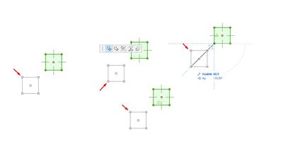
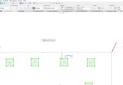
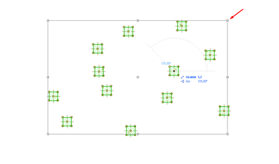
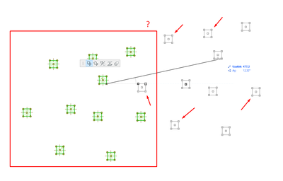
What is the reason for the difference in the appearance of grouped columns in the same Archicad version, as I have marked in the 2 screenshots below?
One shows a rectangle to cover all the grouped columns and the other shows only the move preview of that column when I move one of the grouped columns.
When there was a rectangle to cover the grouped elements, we could notice it before accidentally deleting all the elements belonging to the group, but when this is not the case, we can delete all the grouped elements without noticing them.
Operating system used: Windows Build 5003
Solved! Go to Solution.
Accepted Solutions
- Mark as New
- Bookmark
- Subscribe
- Mute
- Subscribe to RSS Feed
- Permalink
- Report Inappropriate Content
2024-03-28 01:51 PM
I found the reason!
When the number of grouped elements exceeds 10, the program places a big rectangle around the elements to optimize. When the number of elements is below 10, the big rectangle disappears.
- Mark as New
- Bookmark
- Subscribe
- Mute
- Subscribe to RSS Feed
- Permalink
- Report Inappropriate Content
2024-03-28 10:22 AM
Is it because there a trace reference on in the background, so you can see where the columns were (until that reference gets updated)?
Barry.
Versions 6.5 to 27
i7-10700 @ 2.9Ghz, 32GB ram, GeForce RTX 2060 (6GB), Windows 10
Lenovo Thinkpad - i7-1270P 2.20 GHz, 32GB RAM, Nvidia T550, Windows 11
- Mark as New
- Bookmark
- Subscribe
- Mute
- Subscribe to RSS Feed
- Permalink
- Report Inappropriate Content
2024-03-28 12:12 PM
No, I guess I didn't explain it right.
For example, the 2 screenshots I attached below are screenshots taken from Archicad 27 and from different files.
Both are grouped, but in one of them there is a big rectangle around the grouped columns, while in the other there is no big rectangle. What is the difference between them?
- Mark as New
- Bookmark
- Subscribe
- Mute
- Subscribe to RSS Feed
- Permalink
- Report Inappropriate Content
2024-03-28 01:51 PM
I found the reason!
When the number of grouped elements exceeds 10, the program places a big rectangle around the elements to optimize. When the number of elements is below 10, the big rectangle disappears.
- Mark as New
- Bookmark
- Subscribe
- Mute
- Subscribe to RSS Feed
- Permalink
- Report Inappropriate Content
2024-03-28 03:56 PM
Yes, I tried it & worked well even if they’re not grouped only if they are more than 10 and worked also for other elements whatever walls or beams, but what is the logic behind the rectangle? At all great you discovered & thanks for sharing it.
AMD Ryzen 7 5800H with Radeon Graphics 3.20 GHz 16.0 GB
Still looking?
- "D1 Metal" vs. "D1 Commercial" Doors? in Libraries & objects
- Non metric, steel shapes missing in AC29 (W shaped beams,etc) in Libraries & objects
- Transferring surfaces and objects between different projects. in Libraries & objects
- Marquee tool in sections/elevations in Modeling
- Window with different height in Modeling


