- English
- :
- Forum
- :
- Our Community
- :
- Feedback on the restructure
- Subscribe to RSS Feed
- Mark Topic as New
- Mark Topic as Read
- Pin this post for me
- Bookmark
- Subscribe to Topic
- Mute
- Printer Friendly Page
- Mark as New
- Bookmark
- Subscribe
- Mute
- Subscribe to RSS Feed
- Permalink
- Report Inappropriate Content
2023-05-10 09:50 AM
Feedback on the restructure
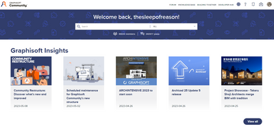
Although the new sub forums improves the overall structure its not enough for a good forum experience. I think the majority of active users primarily are interested in the forum part of the community and it should thus be put front and center. My landing page still looks like below which makes it evident that a lot of earlier feedback regarding user experience must have been disregarded - or is it the platform interface setting a hard limit?
Some points:
- The new forum overview is hidden away under the dropdown item. It should replace or integrate with the hot topics at the landing page.
- It is not possible to quickly navigate between different sub forums. It should not be done through a dropdown and a new page.
- There is no information about the topic of the latest posts in the overview.
- It is not possible to get a list of all new posts (I will still have to use the unread bookmark to effectively keep track of the activity).
- From the overview it is not possible to mark new posts as read.
- User activity (posts/replies) are hidden away under user profile.
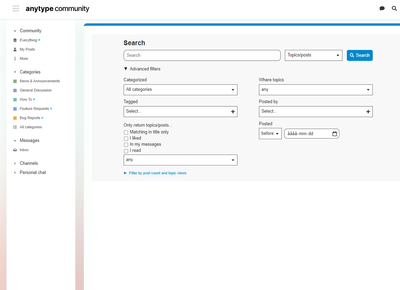
- Search and filter is still quite detached from the forum, limited and cumbersome to use.
It is frustrating to see GS struggle this hard just to get a well functioning, effective and user-friendly forum in place - especially as there are many out of the box solutions available. I understand the approach with the integrating everything under one platform but is it worth it if Khoros can't be set up better than this?
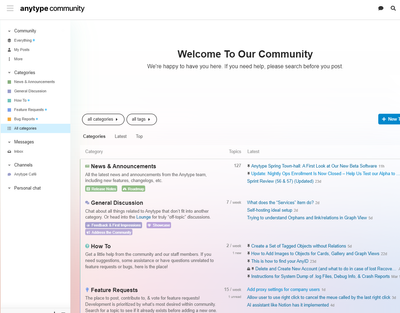
For reference. Below is an example of what an user-friendly (and quite common) forum interface looks like.
- Mark as New
- Bookmark
- Subscribe
- Mute
- Subscribe to RSS Feed
- Permalink
- Report Inappropriate Content
2023-05-10 11:09 AM
Yeah, the list of articles, rather than forum subs, on the side is an odd sight next to all the forum posts...
| AC22-29 AUS 3200 | Help Those Help You - Add a Signature |
| Self-taught, bend it till it breaks | Creating a Thread |
| Win11 | i9 10850K | 64GB | RX6600 | Win11 | R5 2600 | 16GB | GTX1660 |
- Mark as New
- Bookmark
- Subscribe
- Mute
- Subscribe to RSS Feed
- Permalink
- Report Inappropriate Content
2023-05-10 11:33 AM
I rarely look at the right hand column anymore as there is no useful focus to the links. Having it configured as a menu like the "Anytype Community" above would be much more helpful.
- Mark as New
- Bookmark
- Subscribe
- Mute
- Subscribe to RSS Feed
- Permalink
- Report Inappropriate Content
2023-05-11 08:35 AM
Yes, not to push a particular platform but there is a reason for Discourse being so popular. The navigation bar on the side and just one content field which remain in place with fast refresh time is a benchmark for all forum interfaces.
- Mark as New
- Bookmark
- Subscribe
- Mute
- Subscribe to RSS Feed
- Permalink
- Report Inappropriate Content
2023-05-11 05:21 PM
Discourse is really the gold standard out there... A shame GS went on full we-do-everything-in-a-special-way mode again.
(Does anybody care about the unification of knowledge base + other stuff and the forum? I do not think so...)
My List of AC shortcomings & bugs | I Will Piledrive You If You Mention AI Again |
POSIWID – The Purpose Of a System Is What It Does /// «Furthermore, I consider that Carth... yearly releases must be destroyed»
- Mark as New
- Bookmark
- Subscribe
- Mute
- Subscribe to RSS Feed
- Permalink
- Report Inappropriate Content
2023-07-09 12:34 PM
Really pleased to see GS implemented the new sub forums as requested!
But the execution is somewhat strange, as mentioned above. I was confused on the landing page: "where is the forum and forum threads??"
Not sure what the point of the column on the right is for. And the whole label thing....?!
To be honest if the time and energy spent on the new forum had been spent sorting out the UI and user experience of AC, half the forum would not be needed. Half of the people coming to the forum are asking questions because the UI and user experience is so unintuitive and overly complicated.
AC26
https://www.zendsign.fr/
- Mark as New
- Bookmark
- Subscribe
- Mute
- Subscribe to RSS Feed
- Permalink
- Report Inappropriate Content
2023-09-01 07:30 PM
For me the layout is cumbersome at best. GS trying to adapt to web 2.0 or 3.0 or whatever we are at these days. Not working.
Even more annoying is how SLOOOOOoooooOOOOOWWW the whole website is. Makes me yearn for dialup. Pretty much unusable unless you have time to burn and patience.
I have not updated for some time and get grief for that but...... GS is not offering anything that I need. Except a crappy slow web experience. And so we continue our slow inevitable migration away to an undetermined alternate product. Not that GS cares about us single user offices but the upcoming "recession" will give an opportunity to shop around. Sad.
Archicad 28/Windows 11
Alienware 17 R5
i7 2.4 GHz / 16 GB ram
- Mark as New
- Bookmark
- Subscribe
- Mute
- Subscribe to RSS Feed
- Permalink
- Report Inappropriate Content
2023-09-03 05:05 AM - edited 2023-09-03 05:13 AM
Someone from GS once made a passing reference to how outdated or problematic the old forum was (?). I always thought it was a wonderful forum, probably the best out there, built on a couple of decades of experience.
If the leading idea was the ridiculous idea of merging the Forum with the Knowledge Base (probably with the misguided intention of procuring more traffic to the Knowledge Base articles –as if Google had not been enough–, something only the Knowledge Base article creator could care about, a strictly bureaucratic interest), then the problem is the leading idea itself. So that was a hopeless start. Now the development and the followup to the reception was even worse, and I always hoped at some point someone would reconnect with reality and just restore the good old AC Talk. The destruction of the forum has a huge daily cost to Graphisoft, which they are obviously not measuring.
[Btw, when you see things like “Advisor”, “Legend”, “Hero”, don't you all get the feeling this is being run without the slightest clue?]
- Mark as New
- Bookmark
- Subscribe
- Mute
- Subscribe to RSS Feed
- Permalink
- Report Inappropriate Content
2023-09-03 01:59 PM
It is quite clear that the whole community initiative is marketing driven and likely a large part of GS´s growth strategy (together with the S/MEP lure) and I would not be surprised if a 60k member number is presented as an indicator of success - or justification for the takeover of the old relatively user-friendly forum.
The community platform seem to follow the same path as AC where the everyday need of the user is disregarded for "features" initiated by developers and implemented underdeveloped and where any feedback och request for change has to through GS internalisation processes which as you point to is highly bureaucratic.
- Mark as New
- Bookmark
- Subscribe
- Mute
- Subscribe to RSS Feed
- Permalink
- Report Inappropriate Content
2023-09-04 03:44 AM
Yeah, the old forum, though looking outdated, was easier to navigate and read...
The idea of merging the forum and knowledge base, is good in a way, if it worked... Though that maybe just due to the still terrible inbuilt search and topic / thread suggestion function...
| AC22-29 AUS 3200 | Help Those Help You - Add a Signature |
| Self-taught, bend it till it breaks | Creating a Thread |
| Win11 | i9 10850K | 64GB | RX6600 | Win11 | R5 2600 | 16GB | GTX1660 |
Didn't find the answer?
Check other topics in this Forum
Back to ForumRead the latest accepted solutions!
Accepted SolutionsStart a new conversation!
- Simple and FREE quantity take-off AddOn (BIMquantsLite) in Project data & BIM
- Floor plan generator in Parametric design
- Architect Vacancy - Dubai Based - ELE Interior Design - Archicad essential. in General discussions
- Archicad, I havent seen you in so long in General discussions
- Display construction grid with 1x1 mm in Modeling


