Turn on suggestions
Auto-suggest helps you quickly narrow down your search results by suggesting possible matches as you type.
Showing results for
EN
Turn on suggestions
Auto-suggest helps you quickly narrow down your search results by suggesting possible matches as you type.
Showing results for
- English
- :
- Forum
- :
- Project data & BIM
- :
- Re: Template default pens and colours
Options
- Subscribe to RSS Feed
- Mark Topic as New
- Mark Topic as Read
- Pin this post for me
- Bookmark
- Subscribe to Topic
- Mute
- Printer Friendly Page
KeesW
Advocate
Options
- Mark as New
- Bookmark
- Subscribe
- Mute
- Subscribe to RSS Feed
- Permalink
- Report Inappropriate Content
2016-12-29 05:47 AM
Template default pens and colours
2016-12-29
05:47 AM
Let’s look at text options. We have 'Annotation-general' and 'Annotation-text'. They have different line colours and thicknesses. 'Annotation text general' differs from 'Annotation -general'. In this section, text uses 0.35mm whilst headings are 0.25 mm lines. Sorry for being a bit thick for thinking that convention has thicker lines for headings as for standard text. Dimension lines are only 0.13mm.
We have subtle differences between cut structural (0.20) and cut non-structural (0.18) elements. These are the same colour and I doubt if anyone can see the differences between them on a drawing or on a screen. So why do it? Is the template the outcome of a PhD thesis or designed for practical use?
So why don't I change it? Because pens and colour choice should be interrelated with materials, surfaces and object appearances. As Archicad becomes more complex, reconstructing these connections becomes more time-consuming and only academics, or those in large practices with enough spare time, can sustain this overhead expense.
Subtle variations and academic distinctions do not make for sensible and memorable rules. The KISS principle has clearly by-passed the author of our templates. There is much more than can, and should, be said about our templates and I look forward to hearing views from other users.
PS: Archicad-talk may have added an emoticon without my approval. Please ignore it.
Cornelis (Kees) Wegman
cornelis wegman architects
AC 5 - 26 Dell XPS 8940 Win 10 16GB 1TB SSD 2TB HD RTX 3070 GPU
Laptop: AC 24 - 26 Win 10 16GB 1TB SSD RTX 3070 GPU
cornelis wegman architects
AC 5 - 26 Dell XPS 8940 Win 10 16GB 1TB SSD 2TB HD RTX 3070 GPU
Laptop: AC 24 - 26 Win 10 16GB 1TB SSD RTX 3070 GPU
Labels:
- Labels:
-
BIM Management
12 Replies 12
KeesW
Advocate
Options
- Mark as New
- Bookmark
- Subscribe
- Mute
- Subscribe to RSS Feed
- Permalink
- Report Inappropriate Content
2017-01-25 11:32 AM
2017-01-25
11:32 AM
2.5 weeks and still no defenders of the complex templates foisted on us.
Surely someone out there likes them?
Surely someone out there likes them?
Cornelis (Kees) Wegman
cornelis wegman architects
AC 5 - 26 Dell XPS 8940 Win 10 16GB 1TB SSD 2TB HD RTX 3070 GPU
Laptop: AC 24 - 26 Win 10 16GB 1TB SSD RTX 3070 GPU
cornelis wegman architects
AC 5 - 26 Dell XPS 8940 Win 10 16GB 1TB SSD 2TB HD RTX 3070 GPU
Laptop: AC 24 - 26 Win 10 16GB 1TB SSD RTX 3070 GPU
Erwin Edel
Rockstar
Options
- Mark as New
- Bookmark
- Subscribe
- Mute
- Subscribe to RSS Feed
- Permalink
- Report Inappropriate Content
2017-01-25 12:22 PM
2017-01-25
12:22 PM
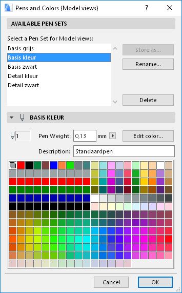
I like the Dutch template, which as far as I can tell does not use the overly complex system of pens international template (and other local templates) have.
Pen 1-10 are black pens when printed with your typical pen weights going from thin to thick. They have easy to distinguish CAD-colours in the set you'd typically use when drafting, so you know when you see a red line, it is the 0,18 mm etc.
21-30 is the same pen weights, but at excactly 50% grey. Great for furniture outlines (not used by default for that sadly), subdued vectorial fills, distinguishing existing structure from to be built
41-50 again same weights, but red. great for MEP / fire safety / etc
61-70 same weights, green great for: see red
81-90 same weights, blue great for: see red
101-110, black pens for cut fills at different weights / uses (can be tweaked to quickly change if wanted). I don't really use a lot of these, mostly stick to what the template offers for the building materials. I like the hairline one for clear drawings when printed
91-100 white to near black grey scale, 91 is the default backgroup pen for everything in the library, great for solid hatch fills in elevations (dark grey for glass, etc)
Everything else is just assorted colours you can use for illustration purposes, the only exception being pen 19, which is probably popular in other library parts as background pen.
I find it easy to use, like the 5 colour options with weights that are above eachother in the pick a pen dialogue and it is easy to remember pen '1' is 0,13 mm pen, so is '21', '41' etc

Erwin Edel, Project Lead, Leloup Architecten
www.leloup.nl
ArchiCAD 9-29NED FULL
Windows 11 Pro for Workstations
Adobe Design Premium CS5
www.leloup.nl
ArchiCAD 9-29NED FULL
Windows 11 Pro for Workstations
Adobe Design Premium CS5
JaseBee
Advocate
Options
- Mark as New
- Bookmark
- Subscribe
- Mute
- Subscribe to RSS Feed
- Permalink
- Report Inappropriate Content
2017-07-06 07:39 AM
2017-07-06
07:39 AM
Having never really been taught traditional CAD drafting practices I've always struggled with the old pen weights/colours problem.
But a few years ago I decided to group things by elements into columns and have types of pens in rows... then graphisoft bought out their idea of how it should be done, so I kind of hybrid-ed their formatting and mine together as it was surprisingly similar.
Unfortunately this was prior to the GO options, but as we haven't upgraded to 20 yet so it still remains useful. However with my limited experience on 20 it seems that GO's are more of a blanket override, so wouldn't perhaps be as suited to objects or other elements that require some nuance between pens for correct display.
In anywise I think I'll keep the pen table I've developed, also made a handy table object to display what each of the pens are (shown attached), unfortunately GDL can't give me a numeric readout of the thicknesses...
AC 24 5004 AUS
iMac OSX (10.13.6) 4.2ghz i7
8gb ram/8gb vram
iMac OSX (10.13.6) 4.2ghz i7
8gb ram/8gb vram
- « Previous
-
- 1
- 2
- Next »
- « Previous
-
- 1
- 2
- Next »
Didn't find the answer?
Check other topics in this Forum
Back to ForumRead the latest accepted solutions!
Accepted SolutionsStart a new conversation!
Suggested topics
- How to set up default settings for a tool? in Modeling
- "D1 Metal" vs. "D1 Commercial" Doors? in Libraries & objects
- priority lines between the footplate, the column, and the beam in Documentation
- How to Update Tool Defaults After Switching to Global Libraries? in Project data & BIM
- Global Library Object Dimension Defaults in Libraries & objects
