
Turn on suggestions
Auto-suggest helps you quickly narrow down your search results by suggesting possible matches as you type.
Showing results for
EN
Turn on suggestions
Auto-suggest helps you quickly narrow down your search results by suggesting possible matches as you type.
Showing results for
- English
- :
- Forum
- :
- Visualization
- :
- Re: Comments Please
Options
- Subscribe to RSS Feed
- Mark Topic as New
- Mark Topic as Read
- Pin this post for me
- Bookmark
- Subscribe to Topic
- Mute
- Printer Friendly Page
Anonymous
Not applicable
Options
- Mark as New
- Bookmark
- Subscribe
- Mute
- Subscribe to RSS Feed
- Permalink
- Report Inappropriate Content
2006-07-31
11:28 PM
- last edited on
2023-05-11
02:24 PM
by
![]() Noemi Balogh
Noemi Balogh
Comments Please
2006-07-31
11:28 PM
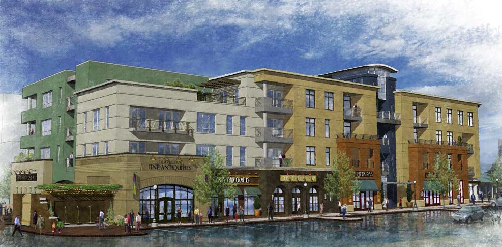
I am a student and have been getting to grips with ArchiCAD and Lightworks mainly by trial and error and finding tips in this forum.
Any comments about improvements will be much appreciated.

6 Replies 6
Anonymous
Not applicable
Options
- Mark as New
- Bookmark
- Subscribe
- Mute
- Subscribe to RSS Feed
- Permalink
- Report Inappropriate Content
2006-07-31 11:33 PM
2006-07-31
11:33 PM
Your windows look not so realistic.
Show some volumes of the brickwall around windows.
Show some volumes of the brickwall around windows.
Anonymous
Not applicable
Options
- Mark as New
- Bookmark
- Subscribe
- Mute
- Subscribe to RSS Feed
- Permalink
- Report Inappropriate Content
2006-08-01 12:03 AM
Anonymous
Not applicable
Options
- Mark as New
- Bookmark
- Subscribe
- Mute
- Subscribe to RSS Feed
- Permalink
- Report Inappropriate Content
2006-08-01 12:57 AM
2006-08-01
12:57 AM
To me that's a pretty good effort. As Archi User 77 was alluding to, the windows could be set back from the wall face, and you could probably do with an "undersun" as explained by Dwight all over the place (try a search) to lighten the soffits.
Anonymous
Not applicable
Options
- Mark as New
- Bookmark
- Subscribe
- Mute
- Subscribe to RSS Feed
- Permalink
- Report Inappropriate Content
2006-08-01 10:15 AM
2006-08-01
10:15 AM
@Mettalen
You have done with Piranesi.
Great job, the road looks like seaside. Anyway nice presentation
You have done with Piranesi.
Great job, the road looks like seaside. Anyway nice presentation
Anonymous
Not applicable
Options
- Mark as New
- Bookmark
- Subscribe
- Mute
- Subscribe to RSS Feed
- Permalink
- Report Inappropriate Content
2006-08-01 12:19 PM
2006-08-01
12:19 PM
I have set back the windows and lightened the soffits and i like the improvement. Here is the changed image.

Anonymous
Not applicable
Options
- Mark as New
- Bookmark
- Subscribe
- Mute
- Subscribe to RSS Feed
- Permalink
- Report Inappropriate Content
2006-08-02 10:47 AM
2006-08-02
10:47 AM
Hey Goodfella
It looks quite decent for someone who has just started on it.
Just some comments: In terms of picture composition, you have decided to use the hedge object from the AC library, and it is quite obvious that it looks pretty weird up close. I can't help but stare at it constantly while looking at the buildings.
Also, I find that adding reflection onto glass surfaces changes the dynamics of the rendered view. Maybe you can tweak up the reflection of the glass material?
Didn't find the answer?
Check other topics in this Forum
Back to ForumRead the latest accepted solutions!
Accepted SolutionsStart a new conversation!
Suggested topics
- Building materials, priorities and linework. in Modeling
- Dialog windows are the max extent of my screen and can't be resized Archicad 28 in Installation & update
- Thinking of Creating BIM Manual builder application. in General discussions
- An Alternative use for Keynotes - Automated Detail Notes in Documentation
- Graphisofts Invoicing system broke. Then said back pay us NOW or we stop your business operating. in General discussions
