Turn on suggestions
Auto-suggest helps you quickly narrow down your search results by suggesting possible matches as you type.
Showing results for
EN
Turn on suggestions
Auto-suggest helps you quickly narrow down your search results by suggesting possible matches as you type.
Showing results for
Options
- Subscribe to RSS Feed
- Mark Topic as New
- Mark Topic as Read
- Pin this post for me
- Bookmark
- Subscribe to Topic
- Mute
- Printer Friendly Page
Anonymous
Not applicable
Options
- Mark as New
- Bookmark
- Subscribe
- Mute
- Subscribe to RSS Feed
- Permalink
- Report Inappropriate Content
2016-07-11 07:16 PM
Archicad file Icon wrong
2016-07-11
07:16 PM
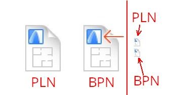
I was wondering if anyone has encountered this problem and if so, how can I resolve it? The Archicad file icon looks as per the attached image (showing the UK map). I am used to seeing a small floor plan, I don't know what has happened. The other issue with this is that I can never tell which one is the back up file and which one is the working file as they look exactly the same.
Thank you very much in advance.

7 Replies 7
Community Admin
Options
- Mark as New
- Bookmark
- Subscribe
- Mute
- Subscribe to RSS Feed
- Permalink
- Report Inappropriate Content
2016-07-12 11:03 AM
2016-07-12
11:03 AM
You should read about the Project Preview Picture in the Help files.
You can set it in the File\Info\Project Preview Dialog.
If saved properly the UK map image should change to this image you define.
About PLN and BPN: I normally have extensions be displayed, this is how I can see which one is which (but I am on Windows, I don't know how that works on Mac).
You can set it in the File\Info\Project Preview Dialog.
If saved properly the UK map image should change to this image you define.
About PLN and BPN: I normally have extensions be displayed, this is how I can see which one is which (but I am on Windows, I don't know how that works on Mac).
Loving Archicad since 1995 - Find Archicad Tips at x.com/laszlonagy
AMD Ryzen9 5900X CPU, 64 GB RAM 3600 MHz, Nvidia GTX 1060 6GB, 500 GB NVMe SSD
2x28" (2560x1440), Windows 10 PRO ENG, Ac20-Ac29
AMD Ryzen9 5900X CPU, 64 GB RAM 3600 MHz, Nvidia GTX 1060 6GB, 500 GB NVMe SSD
2x28" (2560x1440), Windows 10 PRO ENG, Ac20-Ac29
Anonymous
Not applicable
Options
- Mark as New
- Bookmark
- Subscribe
- Mute
- Subscribe to RSS Feed
- Permalink
- Report Inappropriate Content
2016-07-12 11:45 AM
2016-07-12
11:45 AM
Hi one and all,
I still have this question regarding the Archicad icon change. It used to show the icons as per the first image (little floor plan with a red arrow showing the backup file). Now, it started showing as per the second image, comething totally different. Any thoughts anyone?

I still have this question regarding the Archicad icon change. It used to show the icons as per the first image (little floor plan with a red arrow showing the backup file). Now, it started showing as per the second image, comething totally different. Any thoughts anyone?

vistasp
Advisor
Options
- Mark as New
- Bookmark
- Subscribe
- Mute
- Subscribe to RSS Feed
- Permalink
- Report Inappropriate Content
2016-07-16 12:45 PM
2016-07-16
12:45 PM
Laszlo, like you I too always have my extensions always visible.
By default I see a folder in detailed view rather than thumbnails. What I have found that, when the new icons are shrunk, it is almost impossible for (my old) eyes to distinguish between the pln and bpn by the icons alone.

By default I see a folder in detailed view rather than thumbnails. What I have found that, when the new icons are shrunk, it is almost impossible for (my old) eyes to distinguish between the pln and bpn by the icons alone.

= v i s t a s p =
bT Square Peg
https://archicadstuff.blogspot.com
https://www.btsquarepeg.com
| AC INT | Win11 | Ryzen 5700 | 64 GB | RTX 3050 |
bT Square Peg
https://archicadstuff.blogspot.com
https://www.btsquarepeg.com
| AC INT | Win11 | Ryzen 5700 | 64 GB | RTX 3050 |
Karl Ottenstein
Moderator Emeritus
Options
- Mark as New
- Bookmark
- Subscribe
- Mute
- Subscribe to RSS Feed
- Permalink
- Report Inappropriate Content
2016-07-16 06:10 PM
2016-07-16
06:10 PM
vistasp wrote:I can't remember if you're on Windows, Vistasp? In detail view on MacOS 10.11.5, the little red arrow for a BPN is clearly visible. (Thank goodness that they did not eliminate color here, as in the actual AC UI.) Still, the icons are thin compared with those for all other app/doc types on my machine.
... it is almost impossible for (my old) eyes to distinguish between the pln and bpn by the icons alone.
Vote for Wish: Copy/Paste in 3D
AC 29 USA and earlier • hardware key • macOS Taho 26.1 MacBook Pro M2 Max 12CPU/30GPU cores, 32GB
AC 29 USA and earlier • hardware key • macOS Taho 26.1 MacBook Pro M2 Max 12CPU/30GPU cores, 32GB
vistasp
Advisor
Options
- Mark as New
- Bookmark
- Subscribe
- Mute
- Subscribe to RSS Feed
- Permalink
- Report Inappropriate Content
2016-07-16 06:22 PM
2016-07-16
06:22 PM
Yes Karl, I'm on Windows. The red arrow is just about visible -- as a dot.
In the next couple of days I'm going to try and figure out how to make change to default icons. It used to be easy enough in the old days but having just moved from Win7 to Win10, a little poking around is in order. Which reminds me... time to update the signature.
In the next couple of days I'm going to try and figure out how to make change to default icons. It used to be easy enough in the old days but having just moved from Win7 to Win10, a little poking around is in order. Which reminds me... time to update the signature.
= v i s t a s p =
bT Square Peg
https://archicadstuff.blogspot.com
https://www.btsquarepeg.com
| AC INT | Win11 | Ryzen 5700 | 64 GB | RTX 3050 |
bT Square Peg
https://archicadstuff.blogspot.com
https://www.btsquarepeg.com
| AC INT | Win11 | Ryzen 5700 | 64 GB | RTX 3050 |
vistasp
Advisor
Options
- Mark as New
- Bookmark
- Subscribe
- Mute
- Subscribe to RSS Feed
- Permalink
- Report Inappropriate Content
2016-07-18 10:09 AM
2016-07-18
10:09 AM
I'm haven't been able to change the icons but I discovered that my files were still associated with v19.  After changing that association to v20 the arrow for the bpn is more noticeable.
I'd still prefer some colour for the pln files though so the quest continues...

I'd still prefer some colour for the pln files though so the quest continues...

= v i s t a s p =
bT Square Peg
https://archicadstuff.blogspot.com
https://www.btsquarepeg.com
| AC INT | Win11 | Ryzen 5700 | 64 GB | RTX 3050 |
bT Square Peg
https://archicadstuff.blogspot.com
https://www.btsquarepeg.com
| AC INT | Win11 | Ryzen 5700 | 64 GB | RTX 3050 |
Anonymous
Not applicable
Options
- Mark as New
- Bookmark
- Subscribe
- Mute
- Subscribe to RSS Feed
- Permalink
- Report Inappropriate Content
2016-10-20 04:46 PM
2016-10-20
04:46 PM
I have another issue. My pln files are not showing any icons.
If anyone could help me here.

If anyone could help me here.

Still looking?
Suggested topics
