
Turn on suggestions
Auto-suggest helps you quickly narrow down your search results by suggesting possible matches as you type.
Showing results for
EN
Turn on suggestions
Auto-suggest helps you quickly narrow down your search results by suggesting possible matches as you type.
Showing results for
- English
- :
- Forum
- :
- Visualization
- :
- Artlantis rendering results....need opinion...
Options
- Subscribe to RSS Feed
- Mark Topic as New
- Mark Topic as Read
- Pin this post for me
- Bookmark
- Subscribe to Topic
- Mute
- Printer Friendly Page
Anonymous
Not applicable
Options
- Mark as New
- Bookmark
- Subscribe
- Mute
- Subscribe to RSS Feed
- Permalink
- Report Inappropriate Content
2007-05-09
12:27 AM
- last edited on
2023-05-11
12:26 PM
by
![]() Noemi Balogh
Noemi Balogh
Artlantis rendering results....need opinion...
2007-05-09
12:27 AM

12 Replies 12
Anonymous
Not applicable
Options
- Mark as New
- Bookmark
- Subscribe
- Mute
- Subscribe to RSS Feed
- Permalink
- Report Inappropriate Content
2007-05-09 12:29 AM
Dwight
Newcomer
Options
- Mark as New
- Bookmark
- Subscribe
- Mute
- Subscribe to RSS Feed
- Permalink
- Report Inappropriate Content
2007-05-09 01:57 AM
2007-05-09
01:57 AM
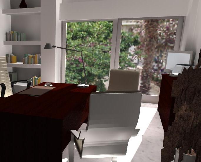
Certainly, the better Maxwellians can make lighting as good as the photograph of the office you posted. I had to look hard....
As for your rendering, which is superior, i have observations:
1: Darkness of brown furniture- very sinister - too dark to reveal form in the image.
2: chromyness of the chair back - should be more matte
3: Desk, chair and potted bush lack shadow connections to the floor.
4: Back corner where shelving hits wall glows too much - should be more in shadow.
5: Relative to the actual photo, you should brighten the background photo to make the oudoors more convincing. The outside world distracts my eye from your story inside.
Keep up the good work!
Dwight Atkinson
Anonymous
Not applicable
Options
- Mark as New
- Bookmark
- Subscribe
- Mute
- Subscribe to RSS Feed
- Permalink
- Report Inappropriate Content
2007-05-09 09:34 AM
2007-05-09
09:34 AM
Thanx a lot Dwight.Still dont know how to make the surfaces look the way they should i dont understand that specular/roughness ratio I try to understand how it works but seems like it works differently every time in different surfaces.i think to make the desk look more real i should make its texture dark but more glossy... (i dont know how  ) as i dont know how to make the chairs legs dont look like a mirror. Its the same material as the chrome in desks legs and on the desk they look good.
 You made my day!!! By the way, when i put the background image as a stretched image or a motif etch it comes out really funny...Is it the glasss or a bug in the rendering engine and if not how can i resize tha image and put it as a background behind the window? What i did is i ve used the same pixels as the rendering on a white background made in paint with the picture of the outside placed on the right spot to show on the rendered window.I hope my english are good enough for you to understand what im saying there is a sample of the result thats is far from real!!!
As for your rendering, which is superior, i have observations:only 5? i would expect more than 18263817629381 especially from you.
Anonymous
Not applicable
Options
- Mark as New
- Bookmark
- Subscribe
- Mute
- Subscribe to RSS Feed
- Permalink
- Report Inappropriate Content
2007-05-09 05:58 PM
2007-05-09
05:58 PM
Im working all day to fix this render.Realised after couple of hours that the background picture is not the problem but the glass in the window in the materials box. I had the archicad glassclear material set to 1.5 transparency and set to glass tranparency.The glas transparency setting makes the background image look they way it looks in my previous post.Looks like a bug to me.Changing the glass transparency setting to air transparency fixed the problem.also tried to make the whole render look better.Waiting for an opinion Im quite huppy but still cant control a lot of things!Thanx in advance and there is the new rendering.

Anonymous
Not applicable
Options
- Mark as New
- Bookmark
- Subscribe
- Mute
- Subscribe to RSS Feed
- Permalink
- Report Inappropriate Content
2007-05-11 12:45 AM
2007-05-11
12:45 AM
My 2 cents. Not worth as much as Dwights, but hope they help:
- I agree, I don't think adding the man was the right choice.
- Add some books/sculpture/something to the cabinet behind the desk.
- The back of your chairs should be the same as the front of the chairs - have a look at how to 'reapply material' in Artlantis.
- Put some pictures into the frames on your wall.
- As Dwight said, the pot plant, desk legs and chair need some shadow to stop them floating.
- Maybe add some blinds to your windows, this will partially solve your background image problems and also stop the distraction of the outside.
But despite all that I think it's a pretty good first render.
Dwight
Newcomer
Options
- Mark as New
- Bookmark
- Subscribe
- Mute
- Subscribe to RSS Feed
- Permalink
- Report Inappropriate Content
2007-05-12 09:11 PM
2007-05-12
09:11 PM
Yes. Adding nonsense figure a bad move.
Does not contribute to a sense of happy story that all renderings need.
Sinister story: Man in jacket = departing burglar.
Just to be really clear, you should add a sack hanging from his arm labeled "SWAG."
Does not contribute to a sense of happy story that all renderings need.
Sinister story: Man in jacket = departing burglar.
Just to be really clear, you should add a sack hanging from his arm labeled "SWAG."
Dwight Atkinson
Anonymous
Not applicable
Options
- Mark as New
- Bookmark
- Subscribe
- Mute
- Subscribe to RSS Feed
- Permalink
- Report Inappropriate Content
2007-05-13 09:16 PM
2007-05-13
09:16 PM
Hahahaha!!!!!First of all thanx both for your coments and to be honest im thinking to make my renderings a lot worse and post em just to see dwights comments.You are unique my friend...
Anonymous
Not applicable
Options
- Mark as New
- Bookmark
- Subscribe
- Mute
- Subscribe to RSS Feed
- Permalink
- Report Inappropriate Content
2007-05-16 08:56 PM
2007-05-16
08:56 PM
Rendering is always a bit trying this and that.
But some reflection in the floor and chair do a lot, while they have a dominant place in the room. Their are a lot of small items with the eye has to focused on, books, different chairs end pc-screen. The diffuse, distract the viewer of look to the room. Mine opinion.
Try to lose the charpenness of the shadow, i use between 4 and 8.
I don't know what kind of sunlight you use ? Depends also how it's looks like.
After al it's a matter of taste
Some examples
Anonymous
Not applicable
Options
- Mark as New
- Bookmark
- Subscribe
- Mute
- Subscribe to RSS Feed
- Permalink
- Report Inappropriate Content
2007-05-22 07:14 PM
2007-05-22
07:14 PM
Great renderings 
Try to make the floor reflective, that will go a long way to insure your furniture does not float.
Actually, most of the materials reflect, specially in dark conditions (indoors), even those that apparently don´t.
Try to make the floor reflective, that will go a long way to insure your furniture does not float.
Actually, most of the materials reflect, specially in dark conditions (indoors), even those that apparently don´t.
Didn't find the answer?
Check other topics in this Forum
Back to ForumRead the latest accepted solutions!
Accepted SolutionsStart a new conversation!
Suggested topics
- Silpu Render for Archicad: photoreal AI renders from your live view, in about a minute (free to try) in General discussions
- 3d PDF or other path limiters? in Visualization
- Simple AI rendering Addon in Visualization
- Curved roof with a slope and two different curves in Modeling
- Crashing while opening, changing or reloading elevations in Modeling
