
Turn on suggestions
Auto-suggest helps you quickly narrow down your search results by suggesting possible matches as you type.
Showing results for
EN
Turn on suggestions
Auto-suggest helps you quickly narrow down your search results by suggesting possible matches as you type.
Showing results for
- English
- :
- Forum
- :
- Installation & update
- :
- Re: 3D TEXT APPEARANCE
Options
- Subscribe to RSS Feed
- Mark Topic as New
- Mark Topic as Read
- Pin this post for me
- Bookmark
- Subscribe to Topic
- Mute
- Printer Friendly Page
Anonymous
Not applicable
Options
- Mark as New
- Bookmark
- Subscribe
- Mute
- Subscribe to RSS Feed
- Permalink
- Report Inappropriate Content
2019-03-29 11:41 AM
3D TEXT APPEARANCE
2019-03-29
11:41 AM
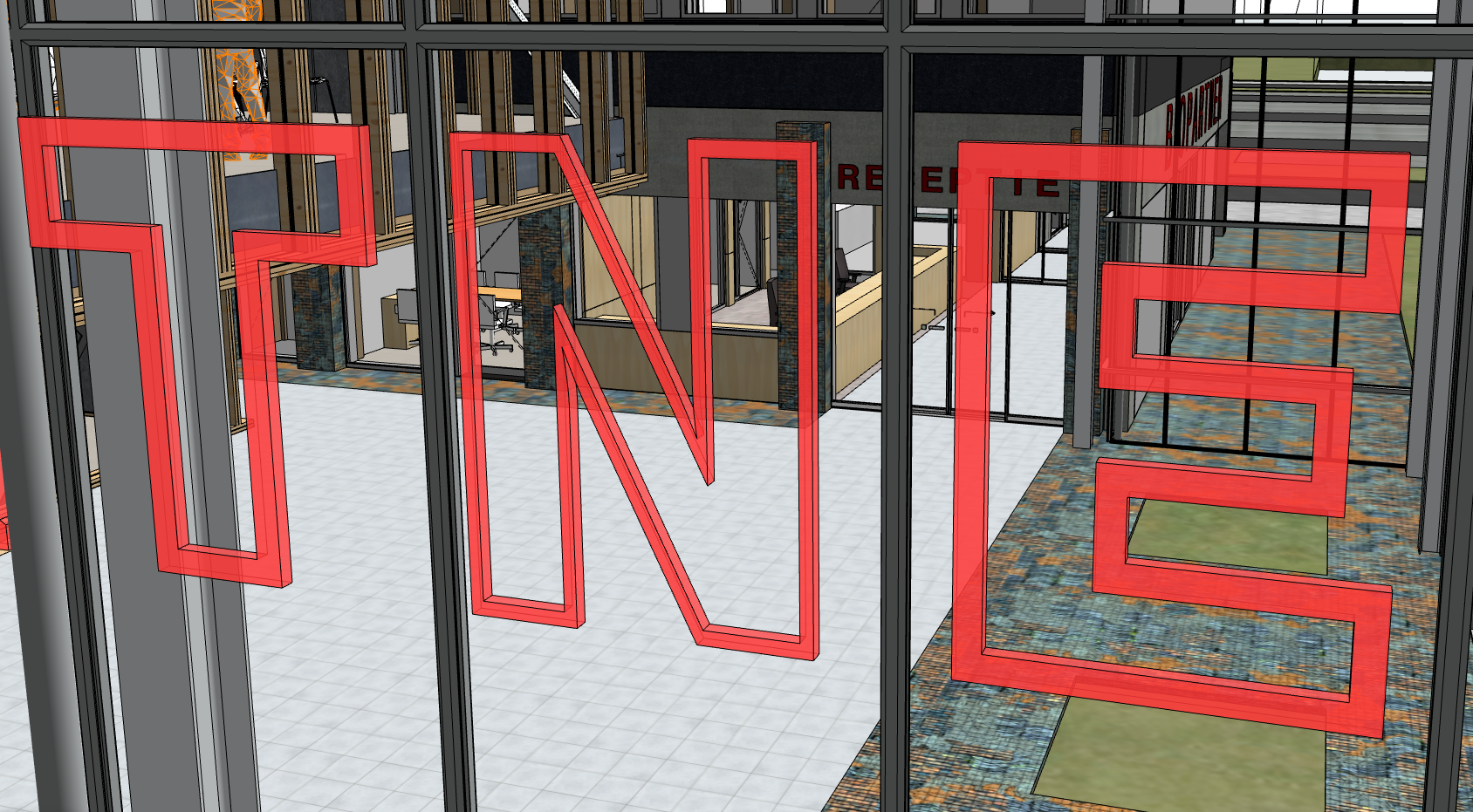
Could you please help me with this issue (as in attached image)?
As you can see the letter N is shown differently, although all the properties are the same with other letters. If I change it onto another letter then it appears normally. So, it is only happening with letter N.
Labels:
- Labels:
-
Performance
5 Replies 5
Barry Kelly
Moderator
Options
- Mark as New
- Bookmark
- Subscribe
- Mute
- Subscribe to RSS Feed
- Permalink
- Report Inappropriate Content
2019-04-01 03:56 AM
2019-04-01
03:56 AM
I am assuming you are using an object to do this.
Is it the 'Text 3D 22' object that comes with the standard library?
If so what font are you using?
It looks like it is having trouble interpreting the hollow inside the N.
I assume if you use a different font that is OK as well.
Barry.
Is it the 'Text 3D 22' object that comes with the standard library?
If so what font are you using?
It looks like it is having trouble interpreting the hollow inside the N.
I assume if you use a different font that is OK as well.
Barry.
One of the forum moderators.
Versions 6.5 to 27
i7-10700 @ 2.9Ghz, 32GB ram, GeForce RTX 2060 (6GB), Windows 10
Lenovo Thinkpad - i7-1270P 2.20 GHz, 32GB RAM, Nvidia T550, Windows 11
Versions 6.5 to 27
i7-10700 @ 2.9Ghz, 32GB ram, GeForce RTX 2060 (6GB), Windows 10
Lenovo Thinkpad - i7-1270P 2.20 GHz, 32GB RAM, Nvidia T550, Windows 11
Lingwisyer
Guru
Options
- Mark as New
- Bookmark
- Subscribe
- Mute
- Subscribe to RSS Feed
- Permalink
- Report Inappropriate Content
2019-04-01 03:59 AM
2019-04-01
03:59 AM
How have these been made? 3D text object? My first thought would be that the surface is degenerating due to the acute angles. Do other letters such as V and M have the same issue?
Ling
Ling
| AC22-29 AUS 3200 | Help Those Help You - Add a Signature |
| Self-taught, bend it till it breaks | Creating a Thread |
| Win11 | i9 10850K | 64GB | RX6600 | Win11 | 5900X | 32GB | GTX2080TI |
Anonymous
Not applicable
Options
- Mark as New
- Bookmark
- Subscribe
- Mute
- Subscribe to RSS Feed
- Permalink
- Report Inappropriate Content
2019-04-01 12:25 PM
Graphisoft Alumni
Options
- Mark as New
- Bookmark
- Subscribe
- Mute
- Subscribe to RSS Feed
- Permalink
- Report Inappropriate Content
2019-04-08 02:55 PM
2019-04-08
02:55 PM
Hi,
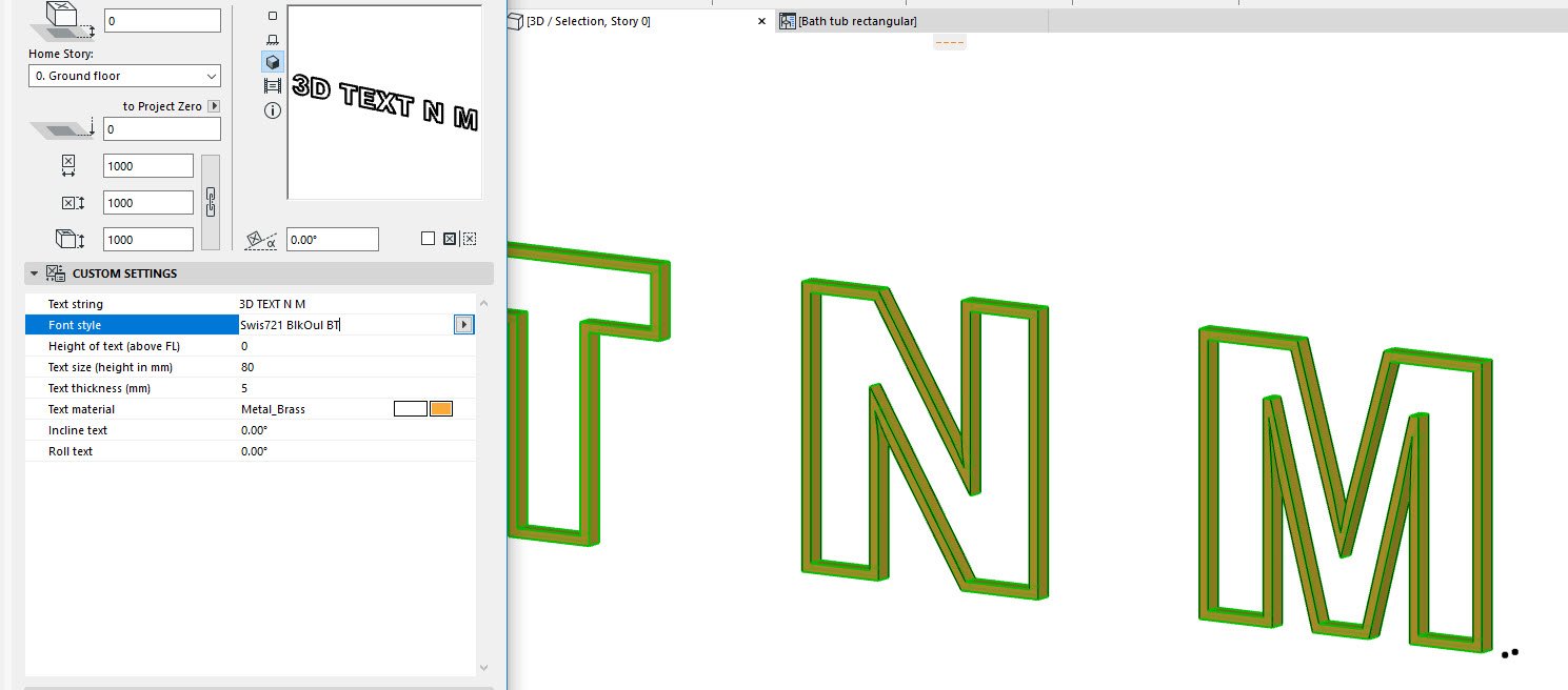
Yeah, it clearly looks like at the sharp angles on the outside of the N, the lines cross themselves when you set it to bold. I don't have such an empty font (and I can't find that specific font online), but I think this is not a generic issue, but a problem with this specific font design.
As you can see in the picture of the non-bold version, right before the corner where it goes wrong, it has a slight change of angle. When you set the font to bold, the edges will be offset, and because of this change of angle, it will intersect itself. This results in a degenerated polygon, so the surfaces fail to properly generate.
Please try it with a different font, or avoid using the bold option for this one. If you need this font and need the letters to be bolder, you can still convert them to morphs and change them manually.
I hope you will be able to work on with this information.
Regards,
Daniel Alexander Kovacs
Professional Services Consultant
GRAPHISOFT
For Troubleshooting and useful Tips & Tricks visit
Professional Services Consultant
GRAPHISOFT
For Troubleshooting and useful Tips & Tricks visit
Barry Kelly
Moderator
Options
- Mark as New
- Bookmark
- Subscribe
- Mute
- Subscribe to RSS Feed
- Permalink
- Report Inappropriate Content
2019-04-09 03:26 AM
2019-04-09
03:26 AM
Sorry I never got around to checking this out.
I don't have the BOLD option in my 3D text object - it is probably an old version.
The standard font works for me but I don't have the 'Greek' version if that makes any difference.
There is a small curve in the internal corners of the 'N' that maybe is what is causing the problem when the bold font is chosen - creating an invalid polygon.
Barry.
One of the forum moderators.
Versions 6.5 to 27
i7-10700 @ 2.9Ghz, 32GB ram, GeForce RTX 2060 (6GB), Windows 10
Lenovo Thinkpad - i7-1270P 2.20 GHz, 32GB RAM, Nvidia T550, Windows 11
Versions 6.5 to 27
i7-10700 @ 2.9Ghz, 32GB ram, GeForce RTX 2060 (6GB), Windows 10
Lenovo Thinkpad - i7-1270P 2.20 GHz, 32GB RAM, Nvidia T550, Windows 11
Still looking?
Suggested topics
- Using Project Info as an editable lookup table — a practical example in Project data & BIM
- Revision ID "00" showing "01" on Layouts & Publisher instead in Documentation
- Text Moves when Creating Object in Libraries & objects
- DWG import in Archicad: incorrect text alignment in Archicad in Collaboration with other software
- Center Labels in a Zone in Libraries & objects
